
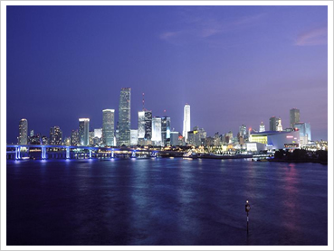
Station Overview
Graphical Climatology of Miami Temperatures, Rainfall and other Variables (1949-Present)
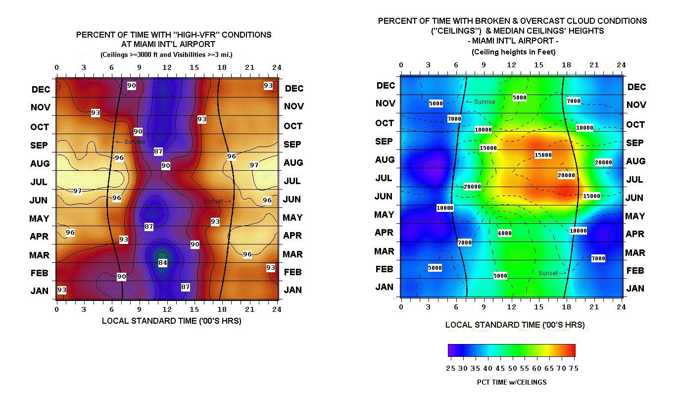
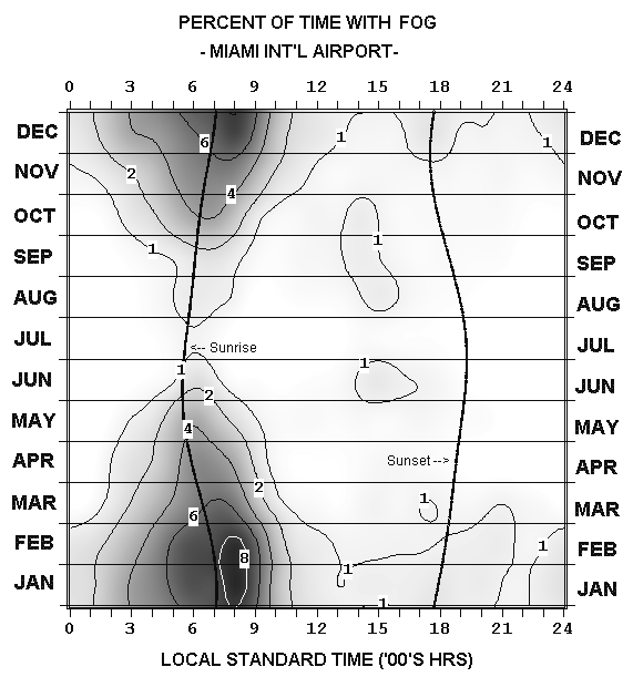
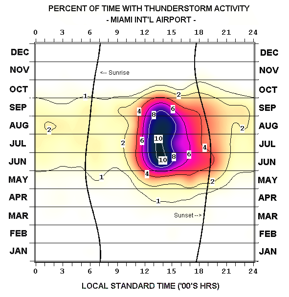
The following is a graphical climatology of Miami, Florida (International Airport) temperatures, precipitation, and various other parameters, from 1949 into the present year 2026. Presented are daily climatological overview charts (temperature and rainfall), annual time-series (temperature and rainfall), “climograms” (hour-by-month depictions of temperature, humidity, winds, Flying Weather, cloud ceilings, fog, and thunderstorms), followed by year-to-year graphs that depict daily max/min temperature, daily mean temperature anomalies, and daily rainfall. The year-to-year graphs go back to 1949, the annual rainfall series back to 1906.
Data updates are made courtesy of the NOAA National Climatic Data Center and the NWS- Miami online site.
Explore the Climate Data
Use these shortcuts to move directly to the principal charts, analyses and historical records.
Daily Temperature And Rainfall Climatologies — RECENT YEARS
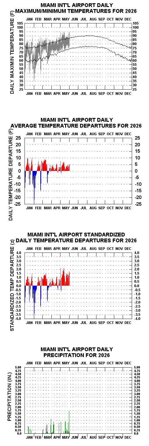
- 2026 Daily Temperature/Precipitation Graphs for Miami NewNew (5/31/26)
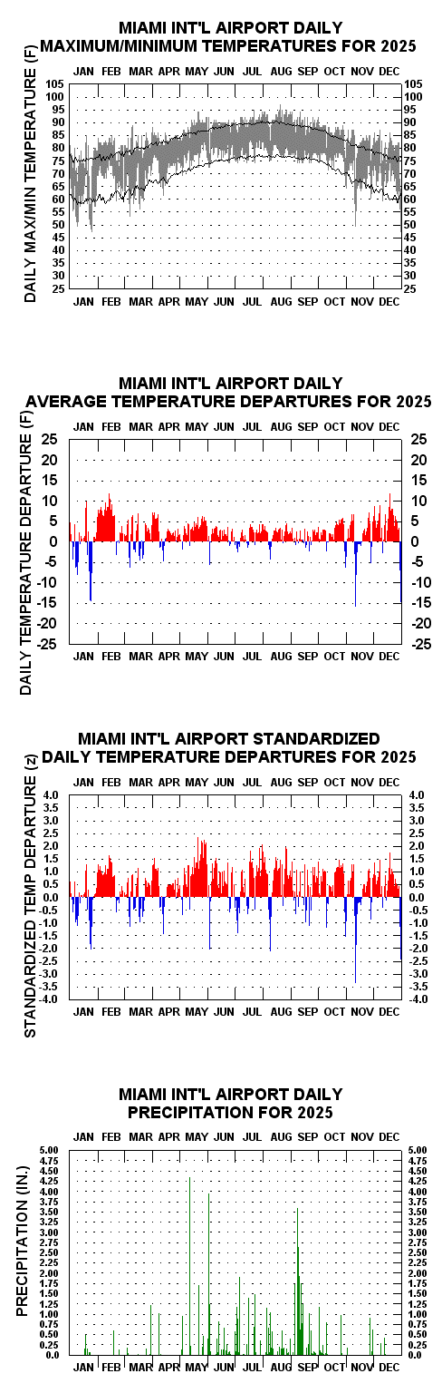
- 2025 Daily Temperature/Precipitation Graph for Miami NewNew (12/31/25)
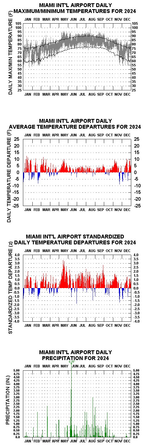
- 2024 Daily Temperature/Precipitation Graph for Miami
- 2023 Daily Temperature/Precipitation Graph for MiamiWarmest Year in History (79.8 F)
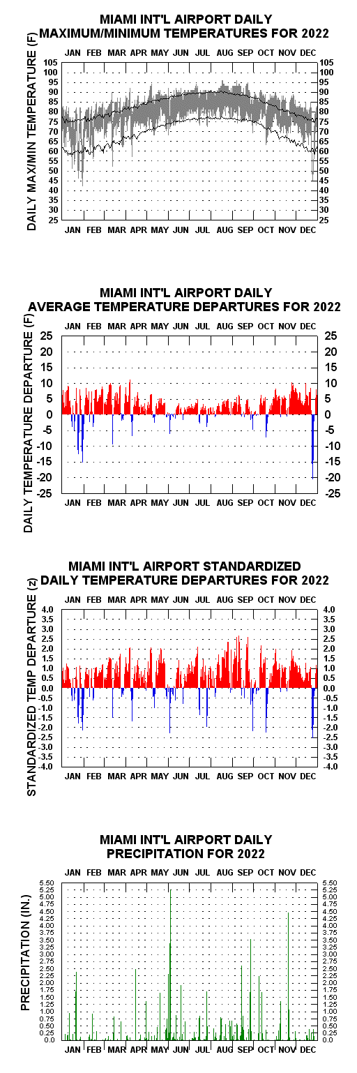
- 2022 Daily Temperature/Precipitation Graph for Miami
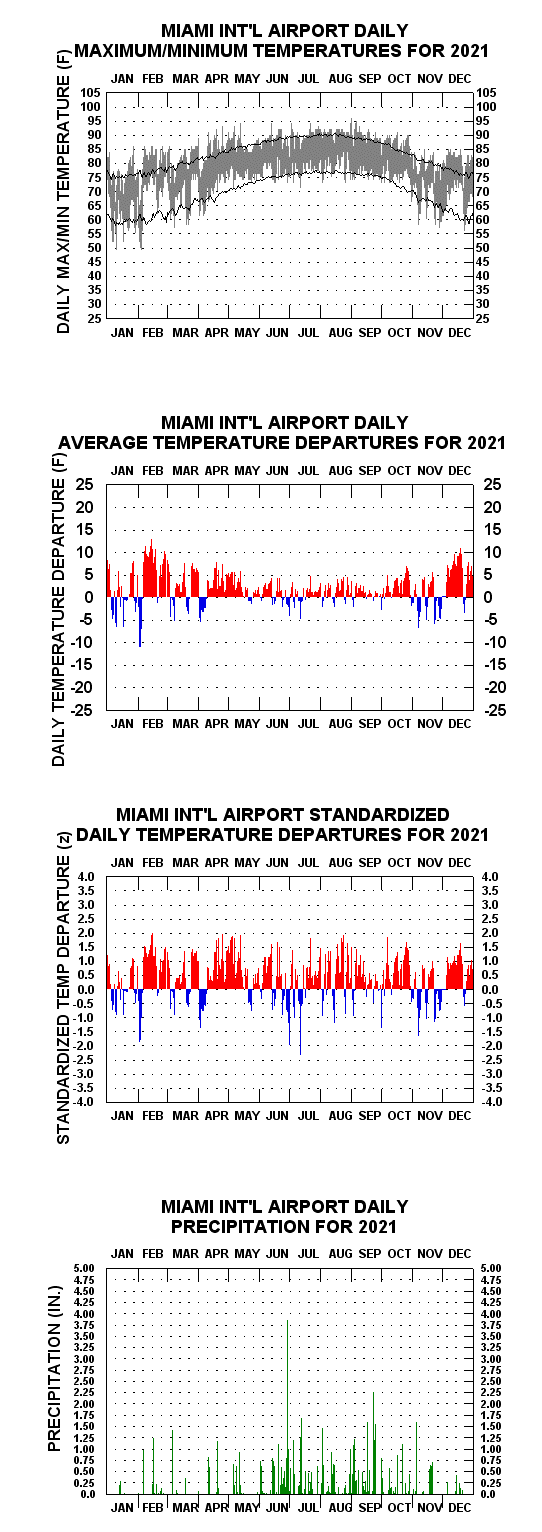
- 2021 Daily Temperature/Precipitation Graph for Miami
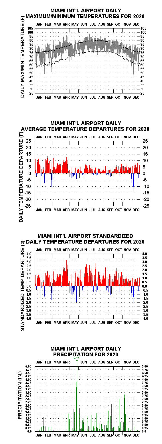
- 2020 Daily Temperature/Precipitation Graph for Miami
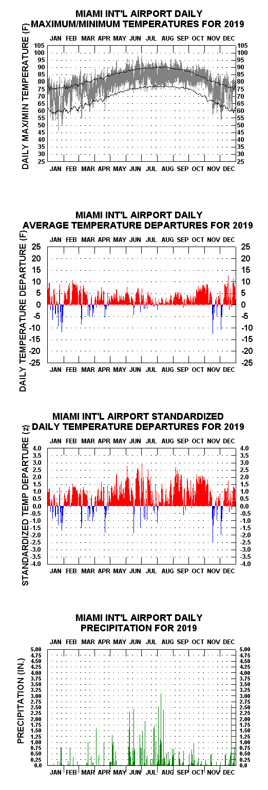
- 2019 Daily Temperature/Precipitation Graph for Miami
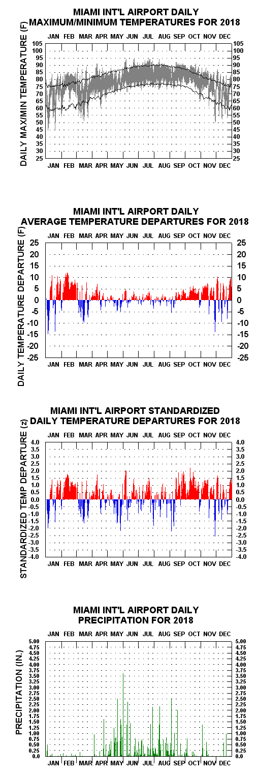
- 2018 Daily Temperature/Precipitation Graph for Miami
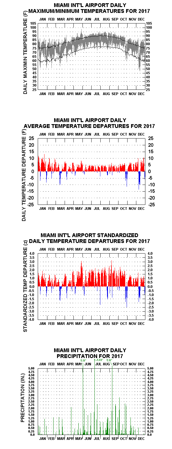
- 2017 Daily Temperature/Precipitation Graph for Miami

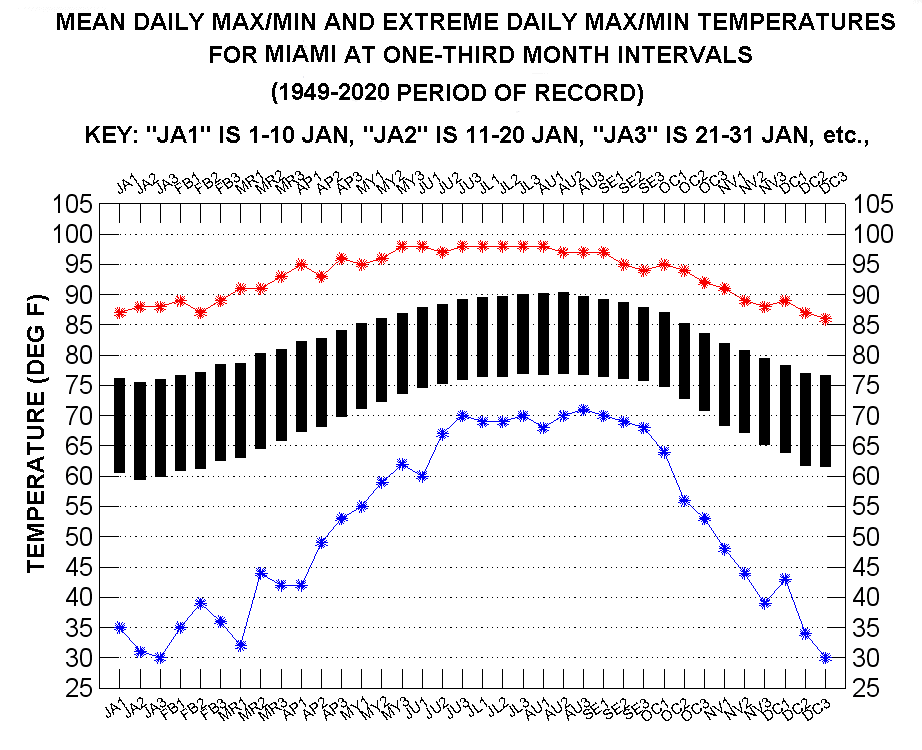
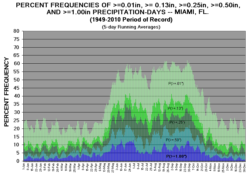
Miami Daily Temperatures And Rainfall Probabilities
Annual Temperature And Rainfall Time-Series:
- Miami Annual Mean Temperature History (1949-2025) NewNew (1/5/26)
- Miami Coldest Wind Chill Temperatures, by Year (1948-2023)
- Miami Highest Heat Index Temperatures, by Year (1948-2023)
- Miami Annual Rainfall History (1906-2025) NewNew (1/5/26)
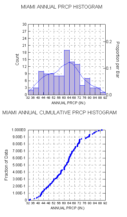
- Miami Annual Precipitation Histograms
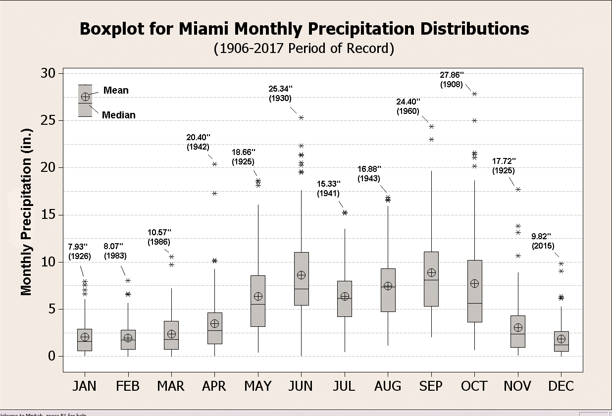
- Boxplot of Miami Calendar Month Precipitation Distributions
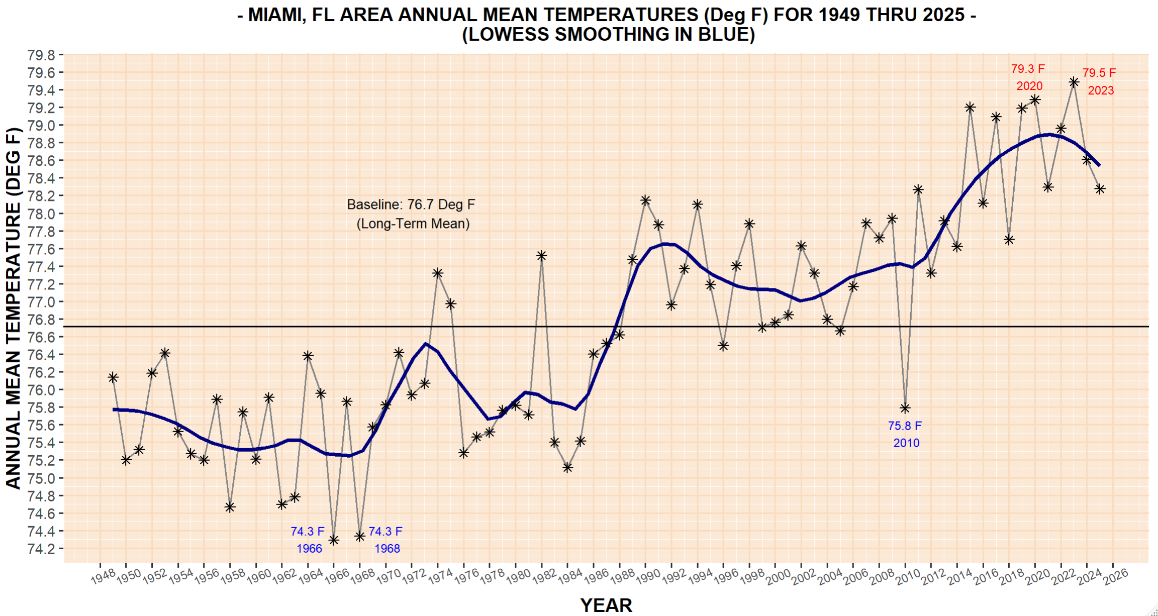
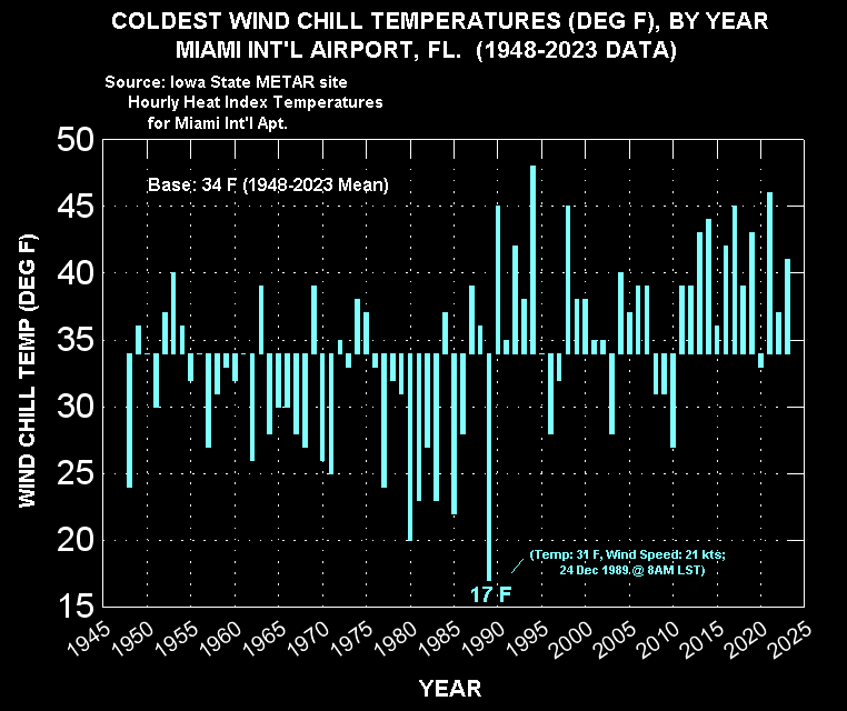
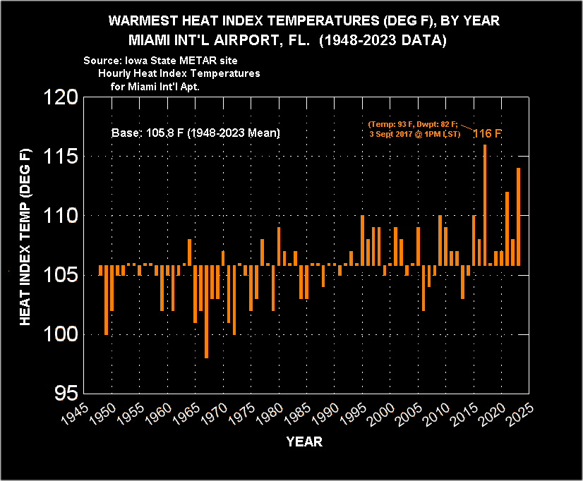
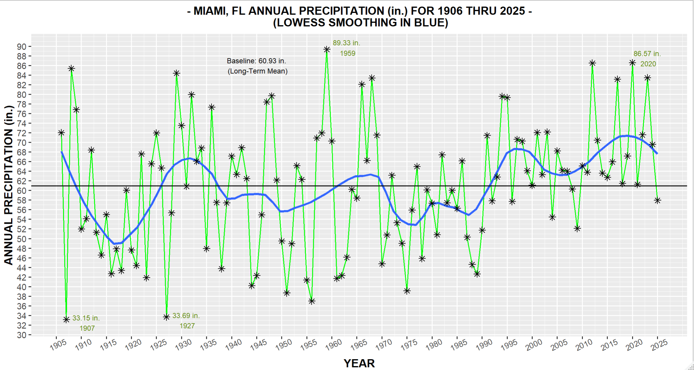
Hour By Month Climograms & Other
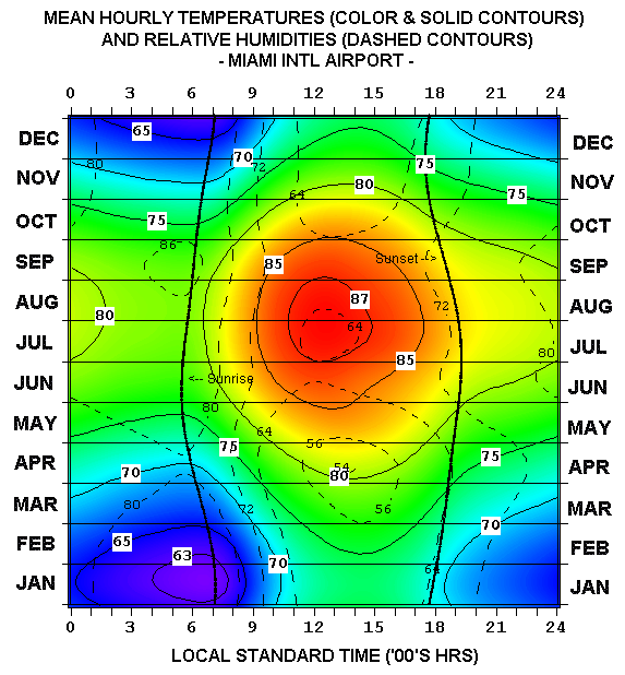
- Miami Mean Hourly Temperatures/Humidities
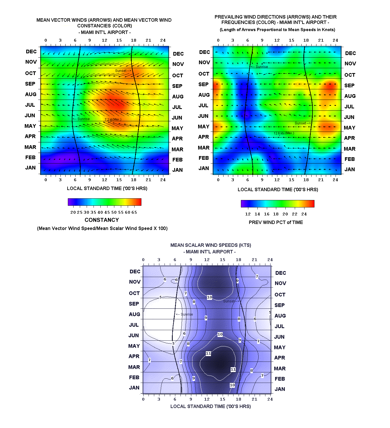
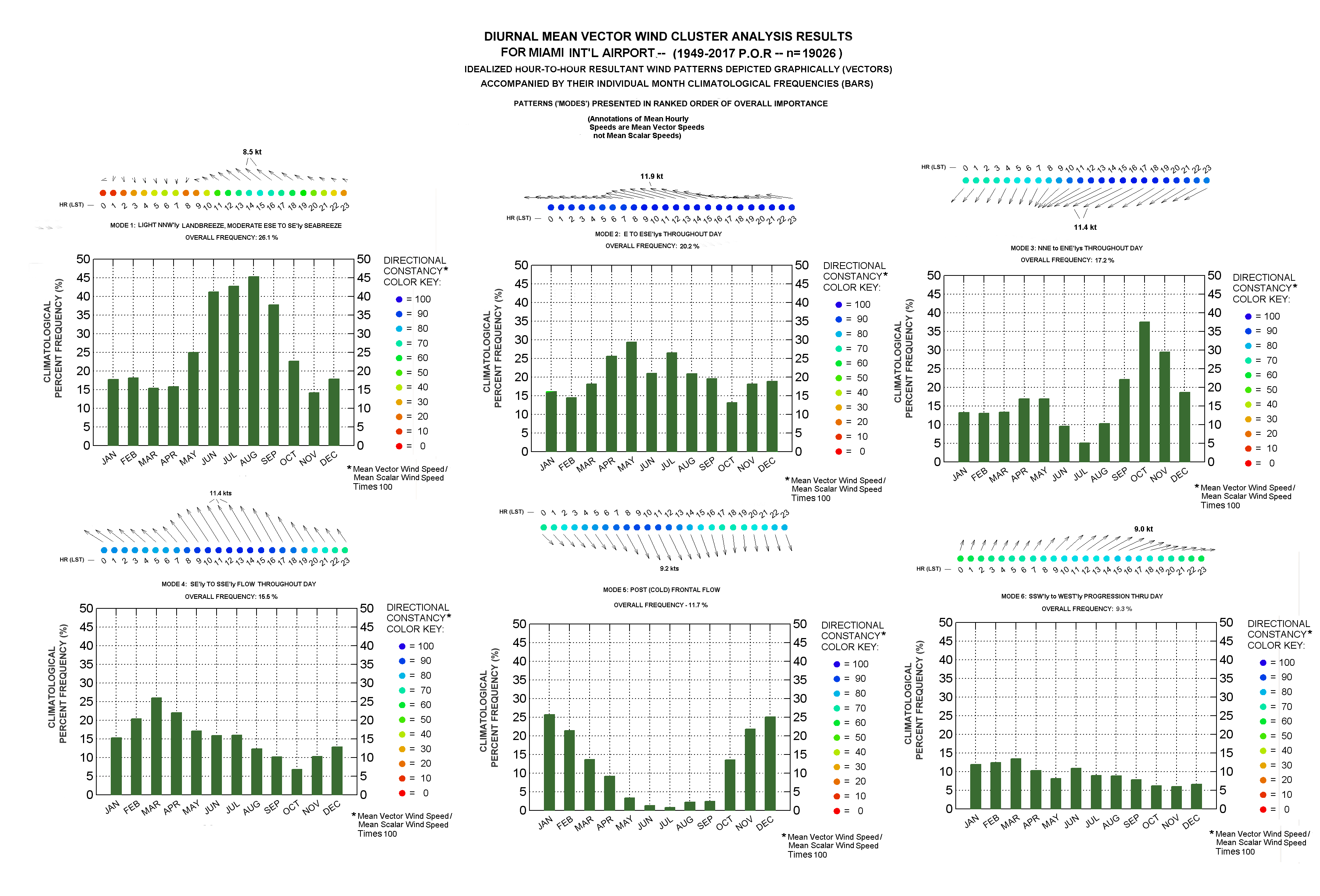
- Miami Winds (Mean Vector Winds, Prevailing Winds, Mean Speeds)
- Miami Flying Weather/Ceilings (Percent Time High VFR, Percent Time with Ceilings/Median Ceilings’ Heights)
- Miami Fog Incidence
- Miami Thunderstorm Incidence
- Cluster Analysis of Miami Midnight-to-Midnight Resultant Wind Patterns
Year-To-Year Graphs:
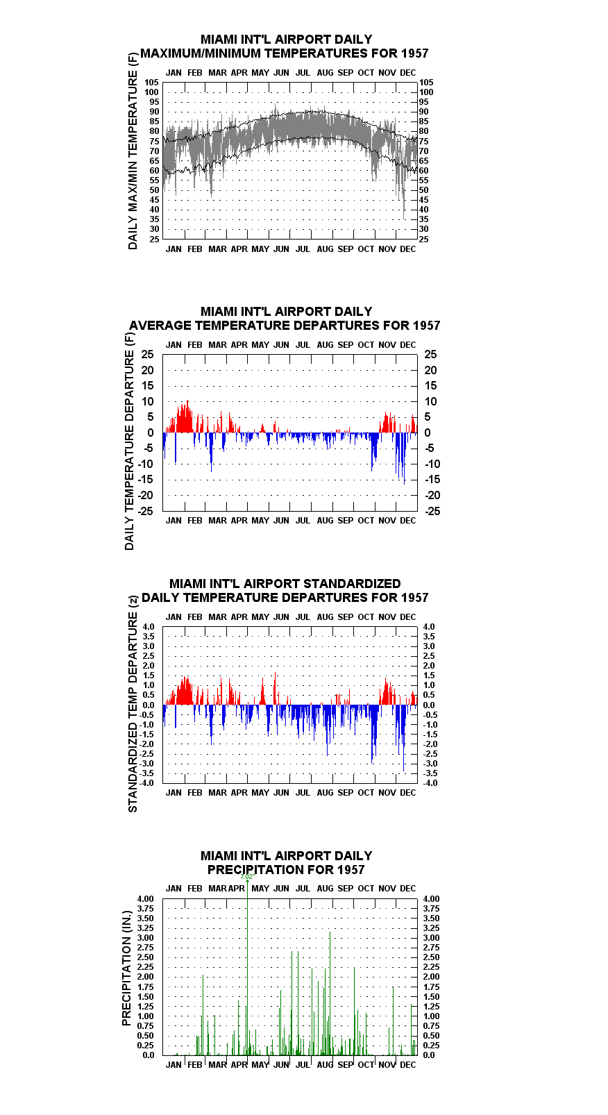
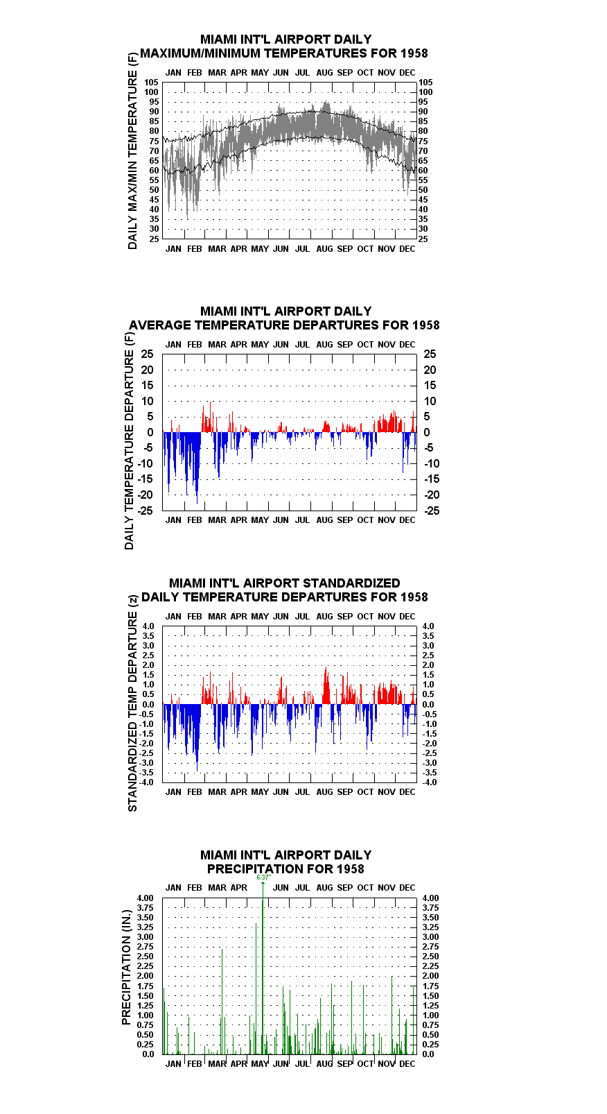
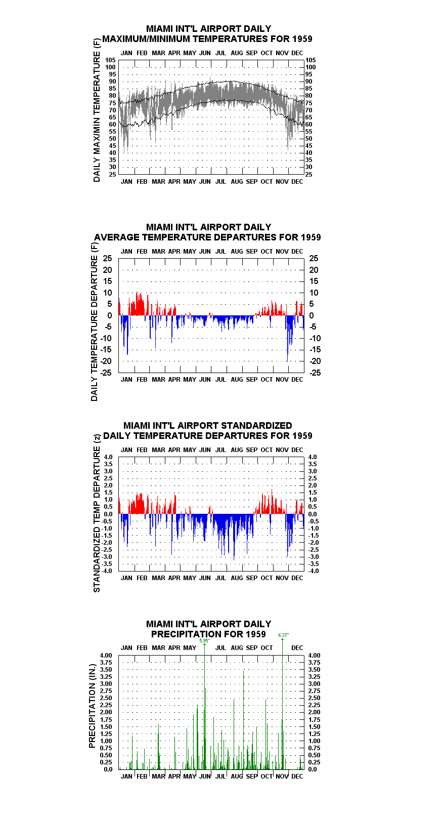
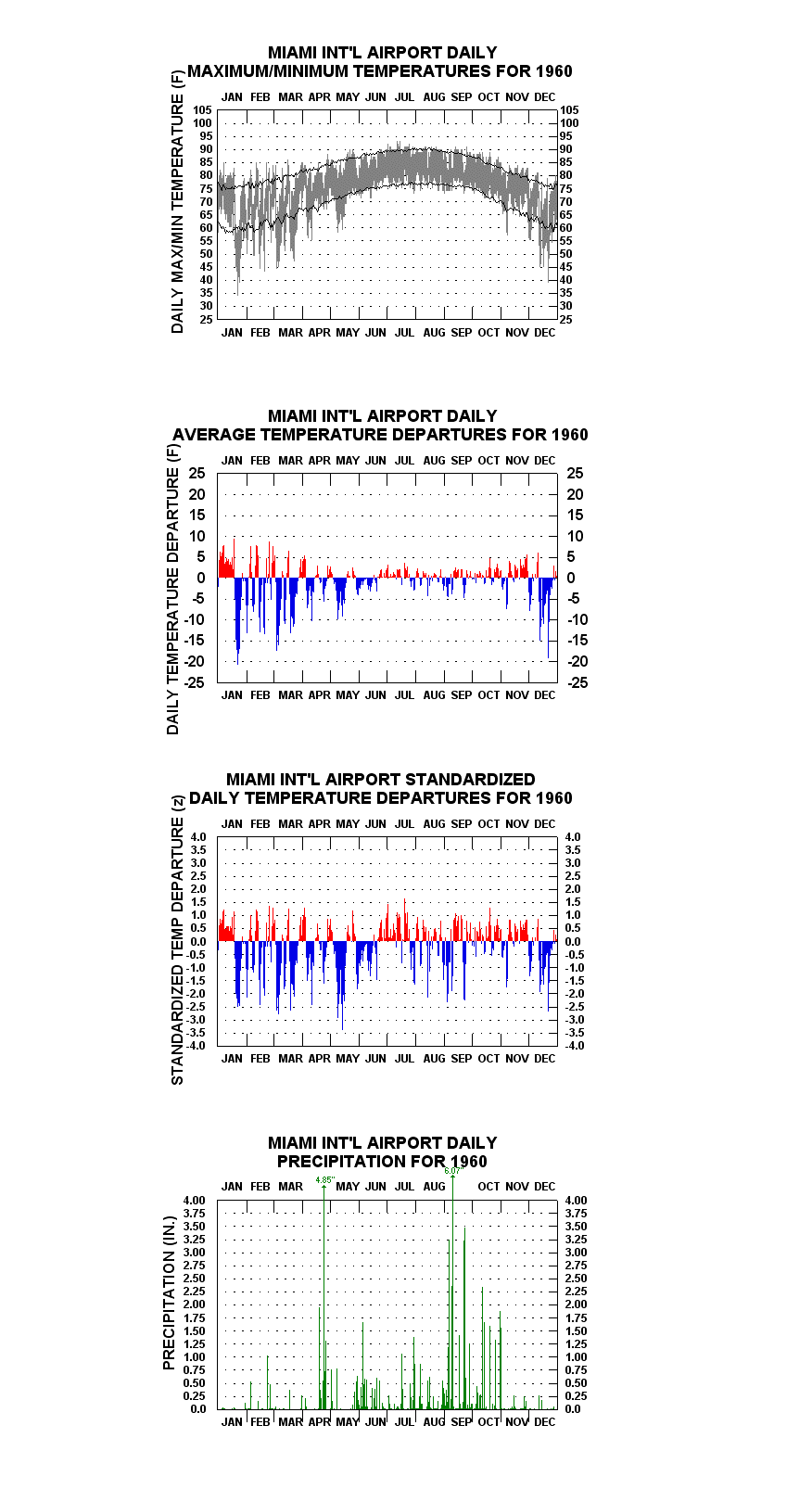
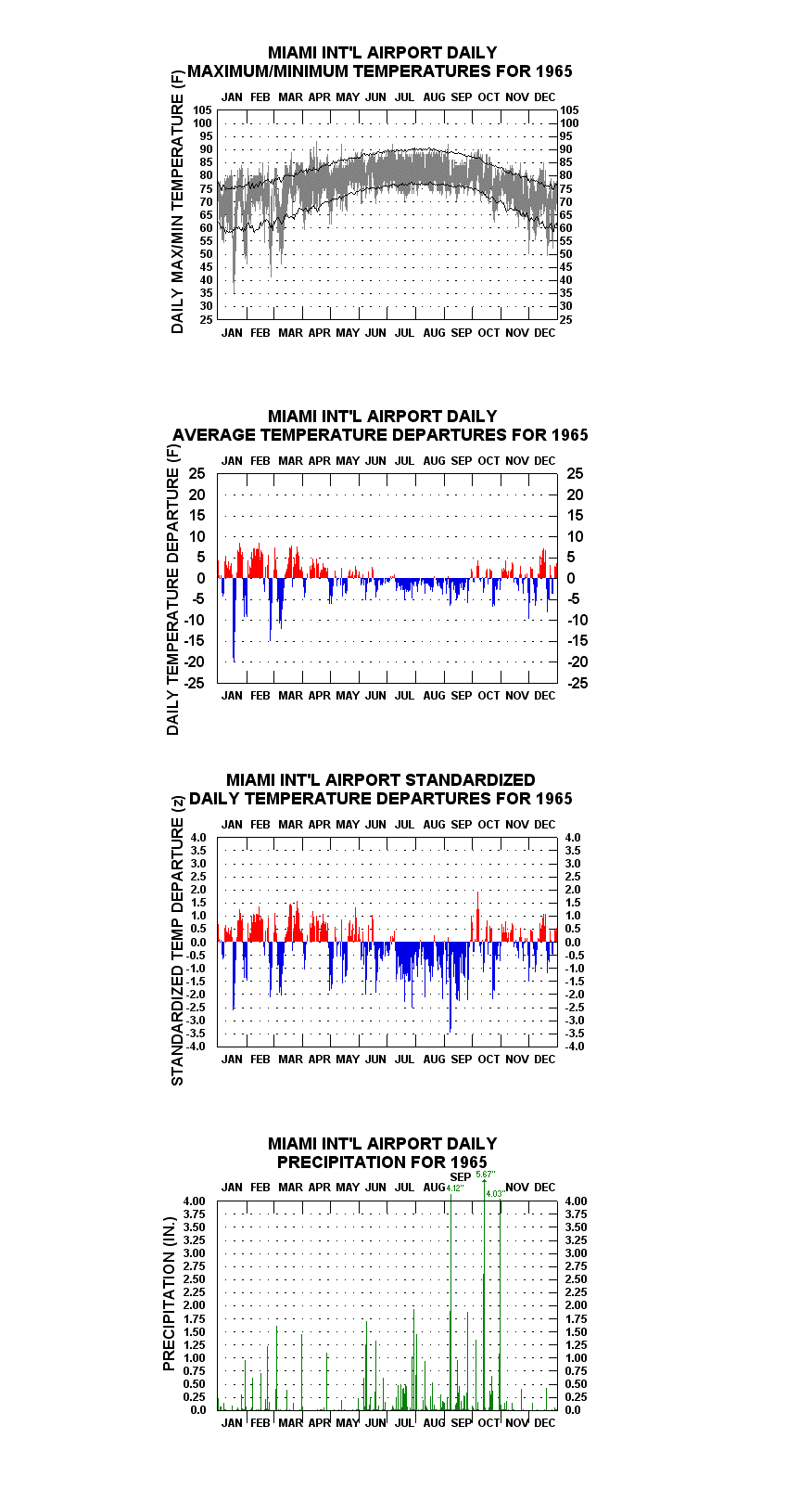
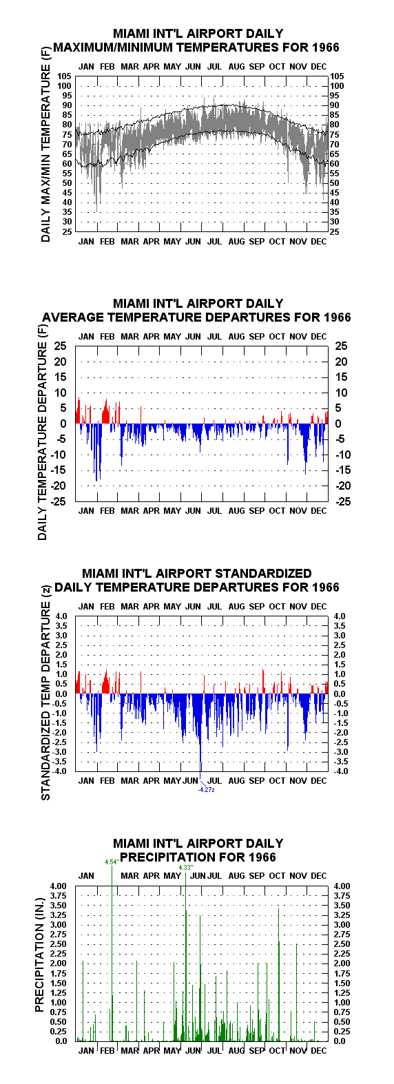
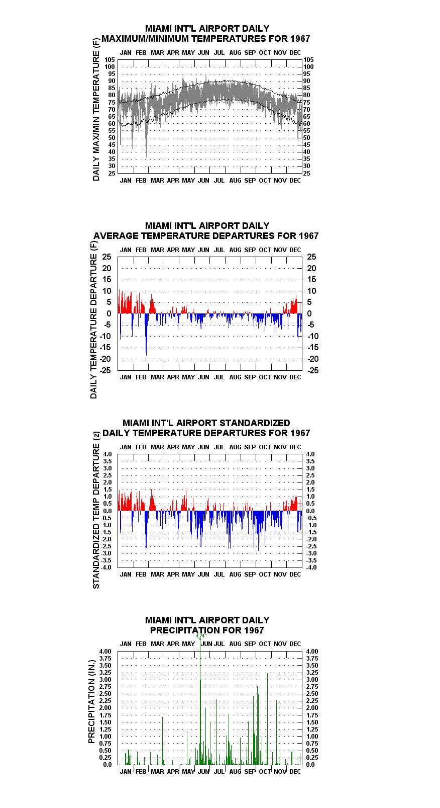
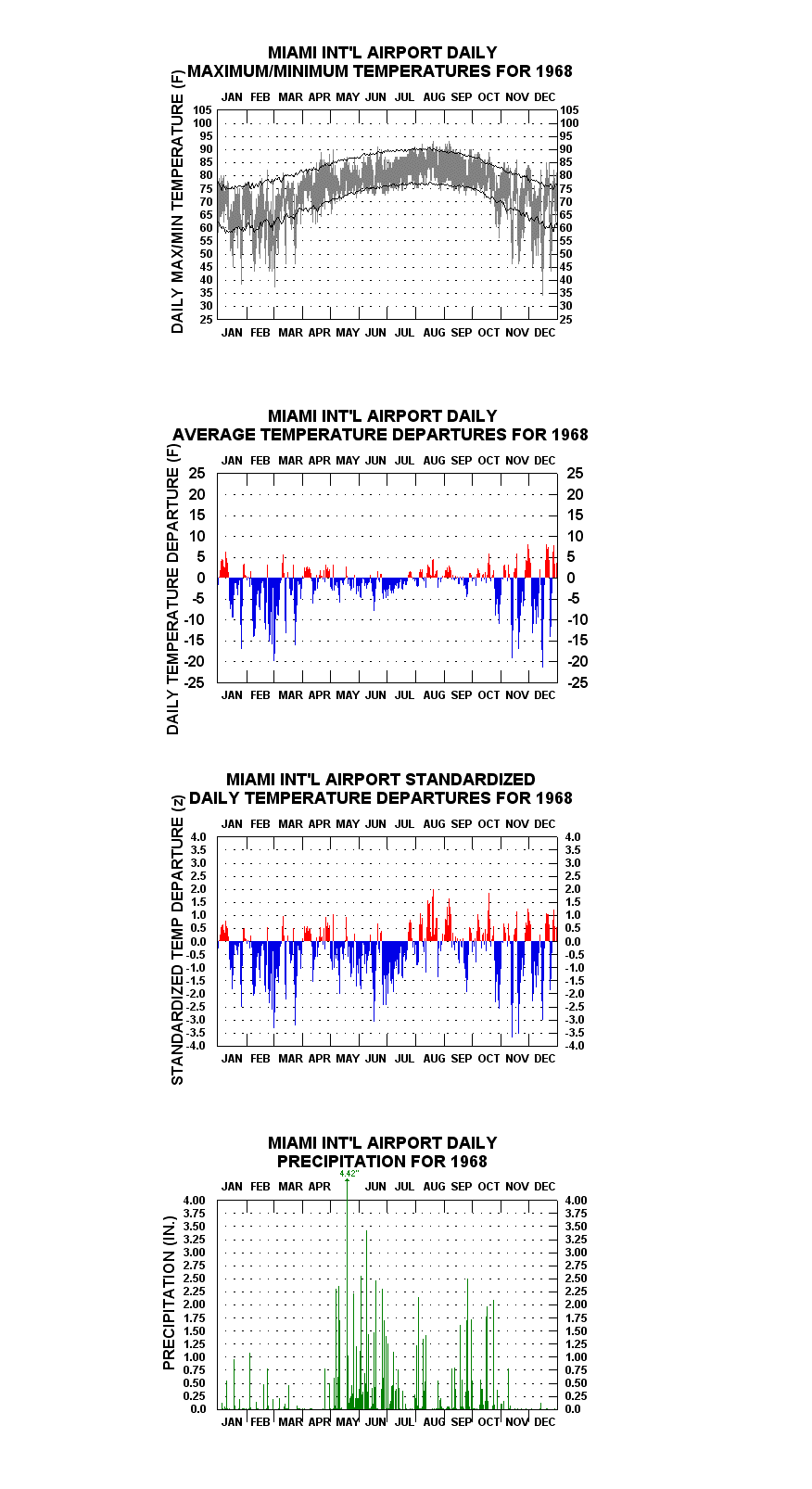
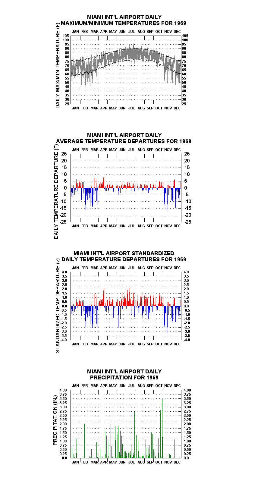
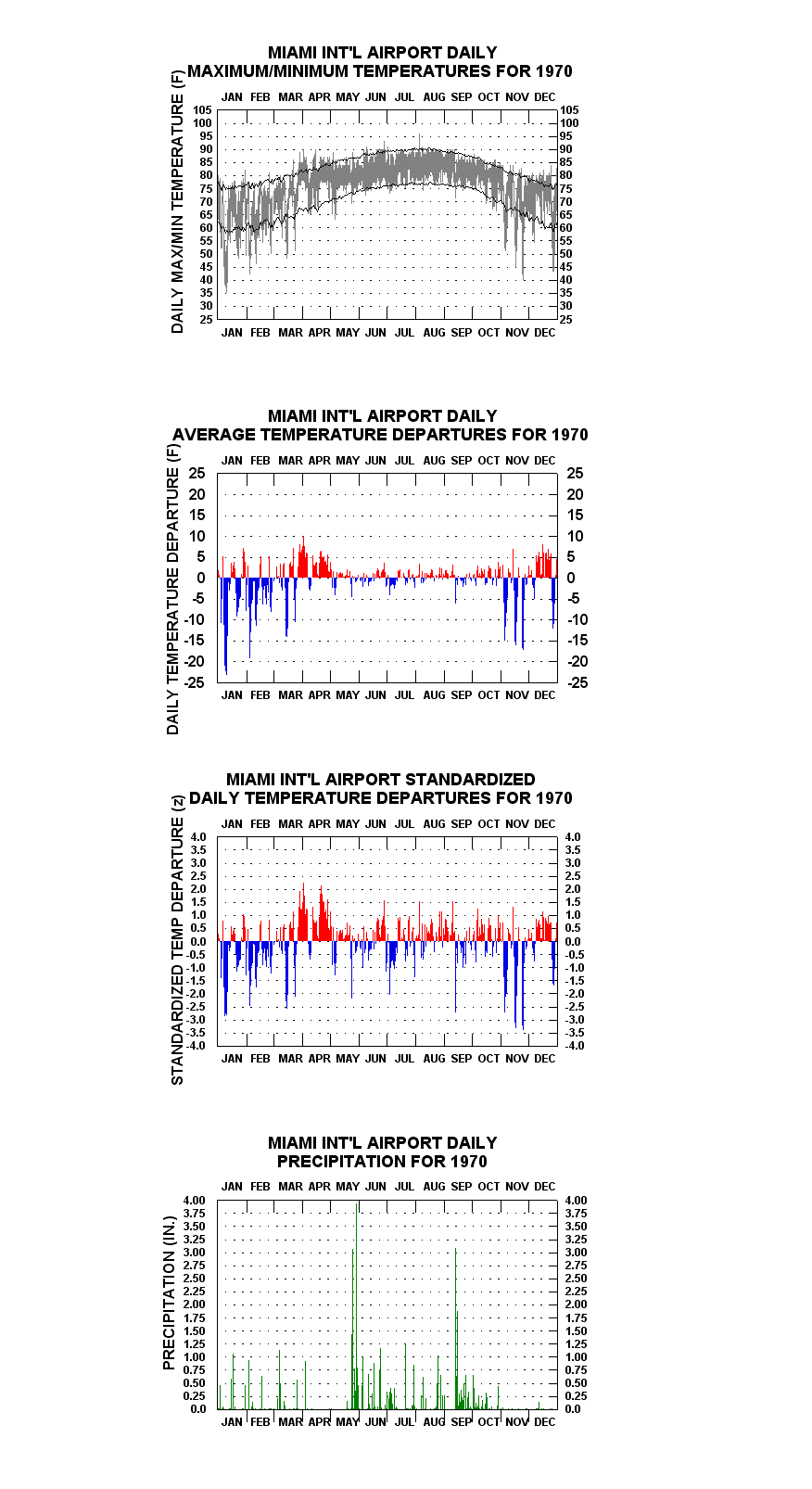
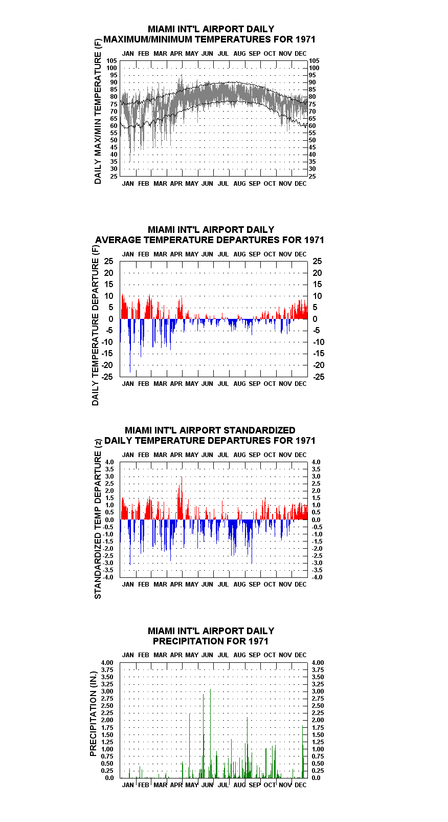
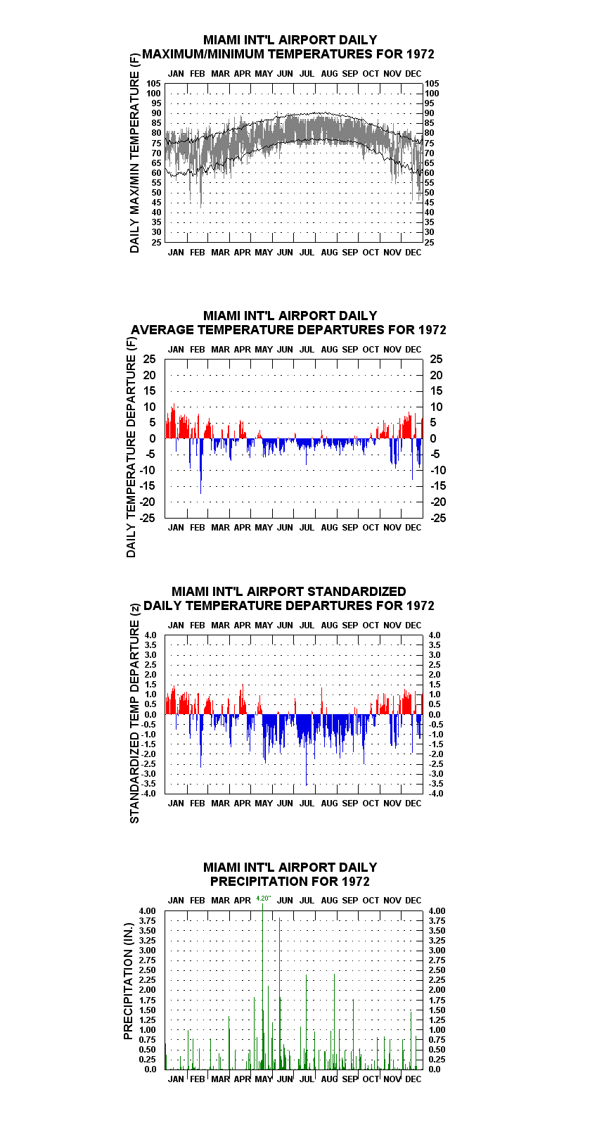
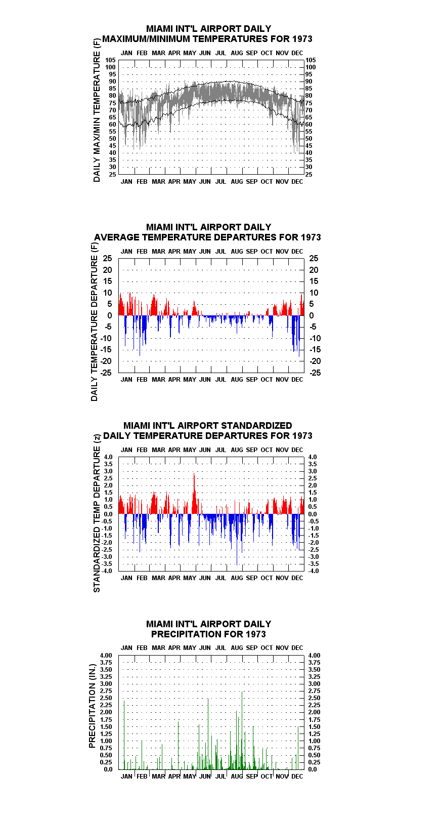
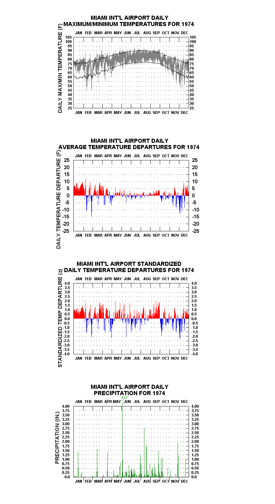
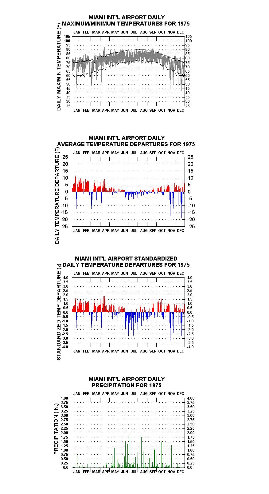
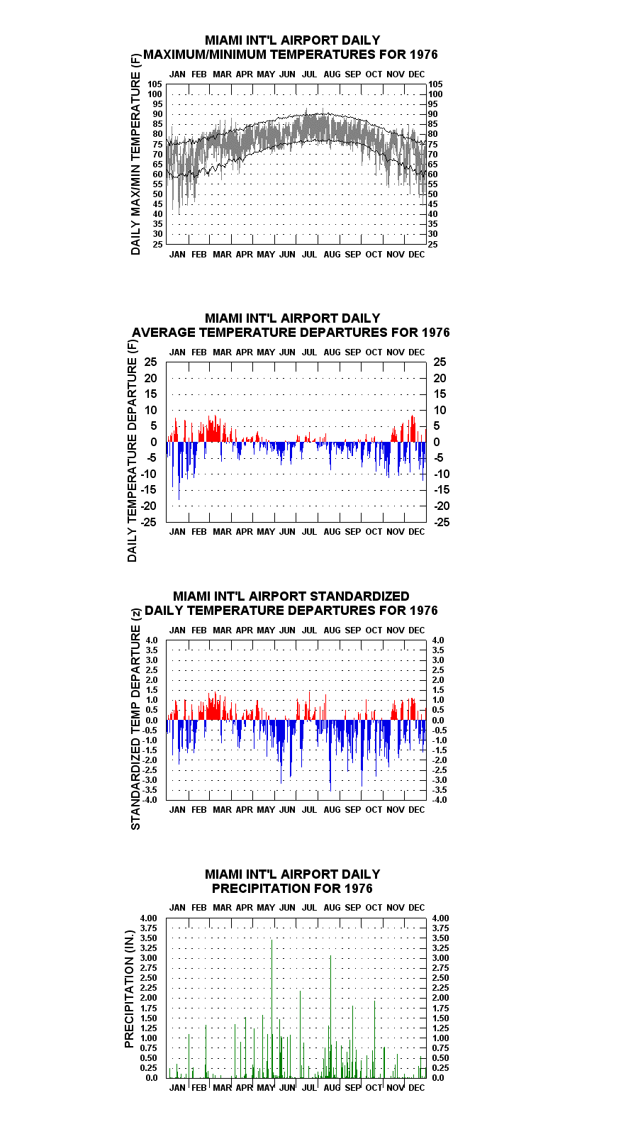
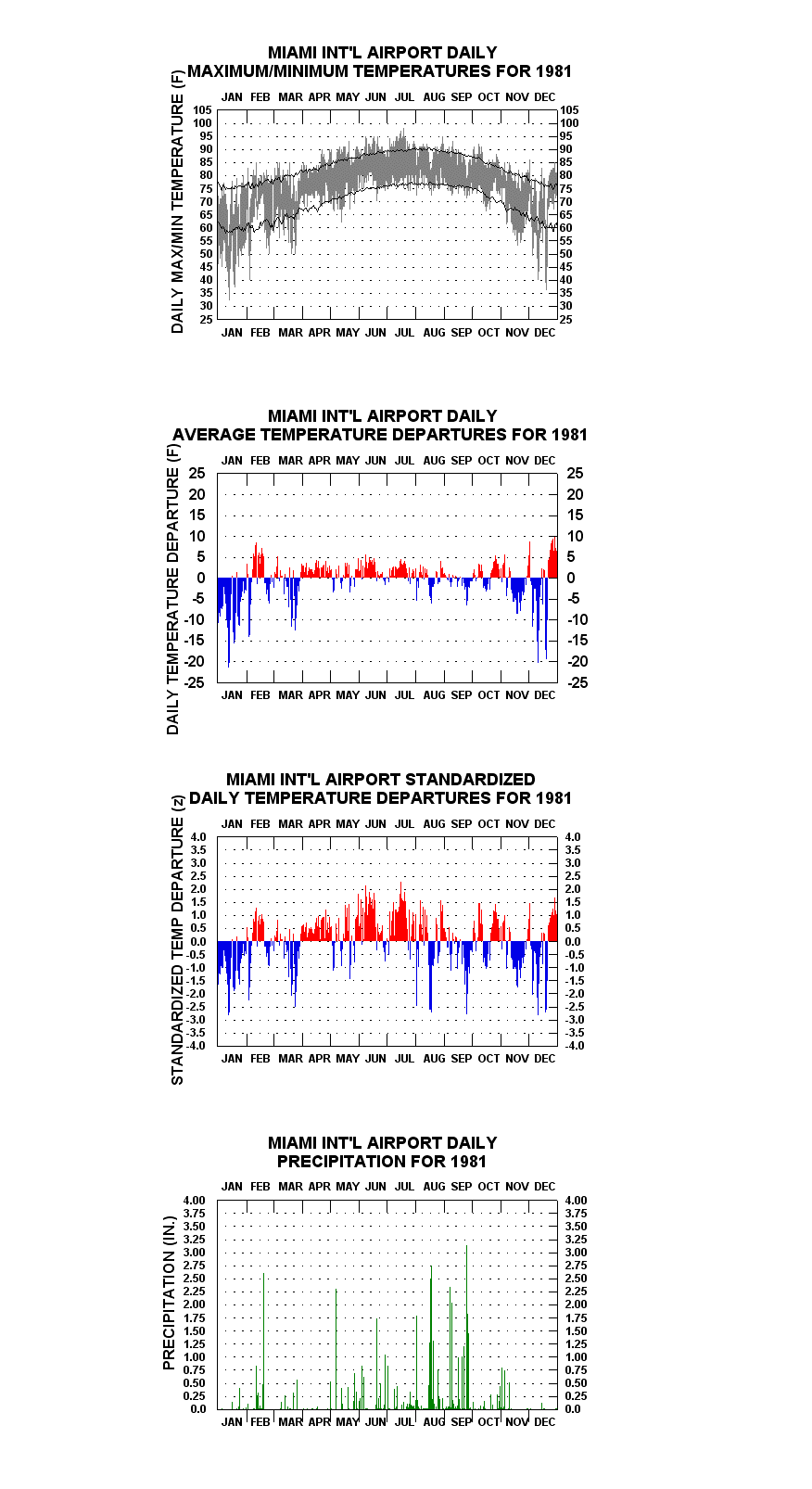
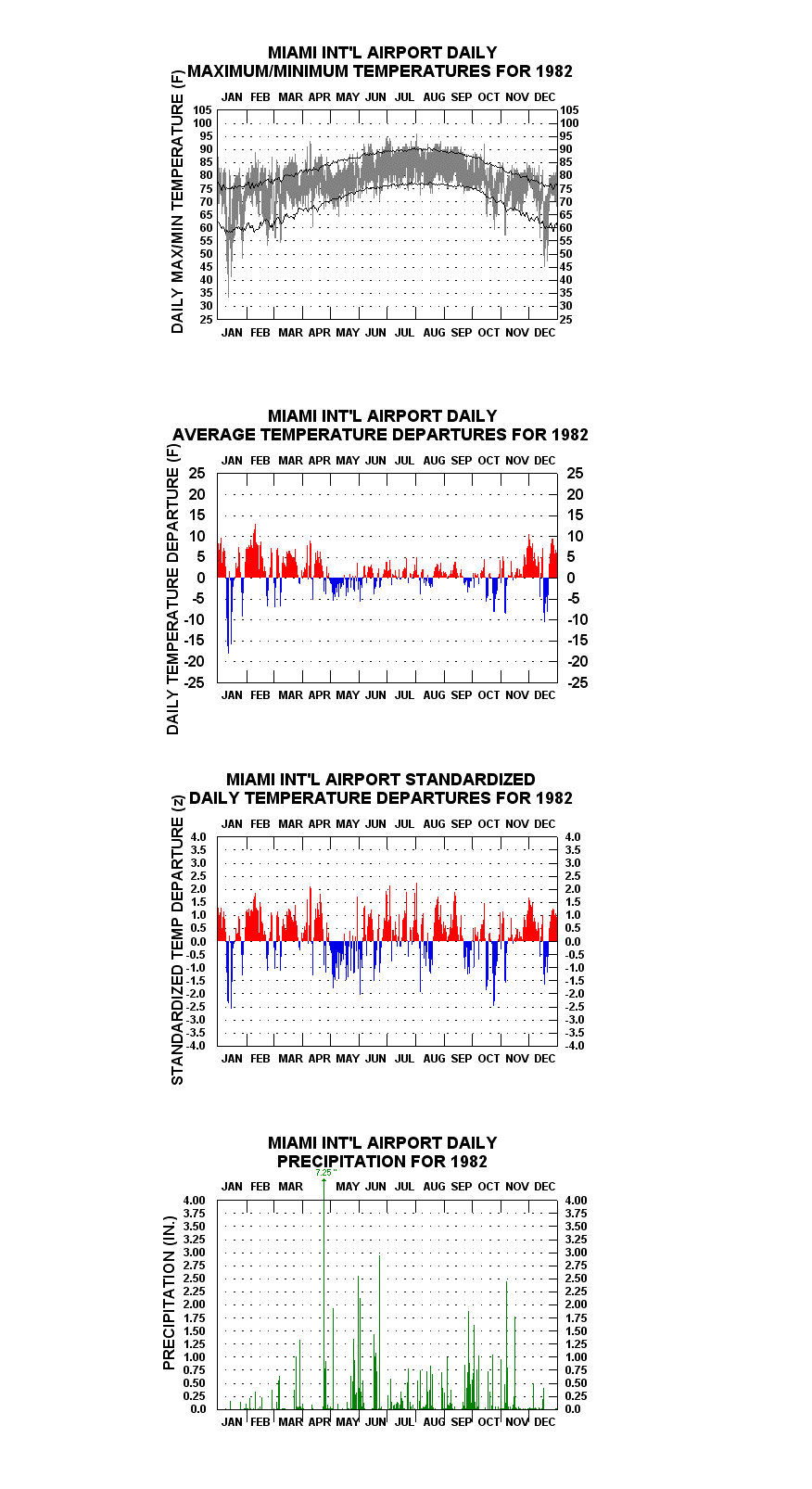
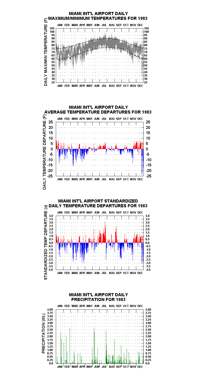
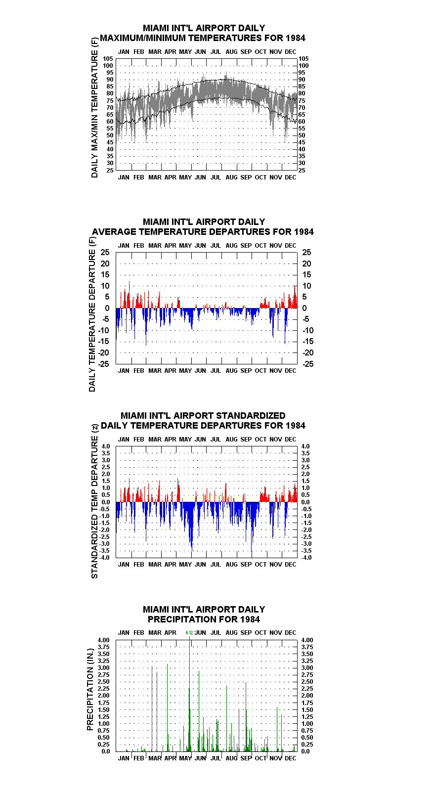
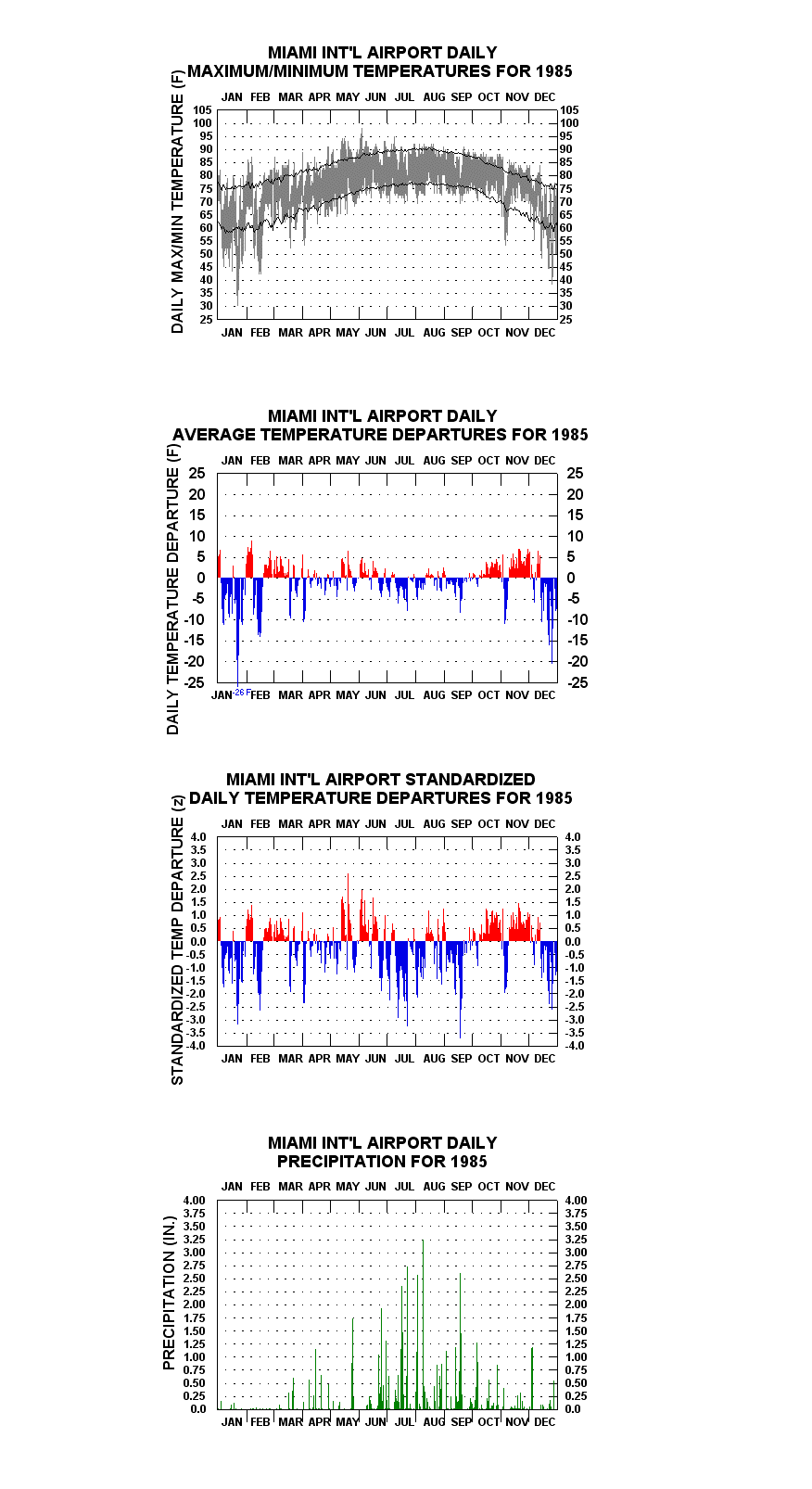
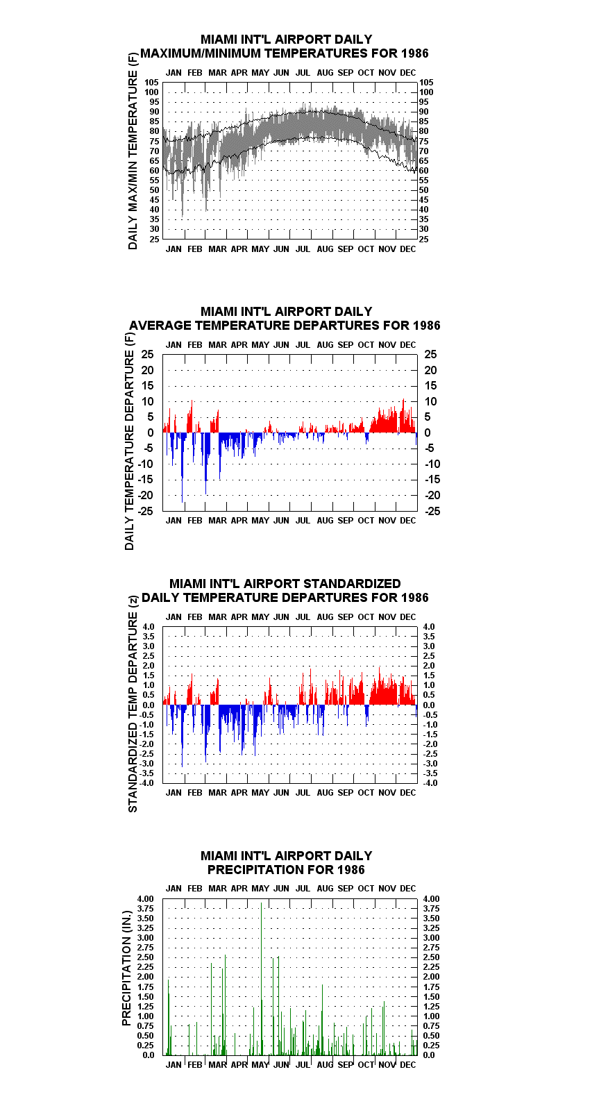
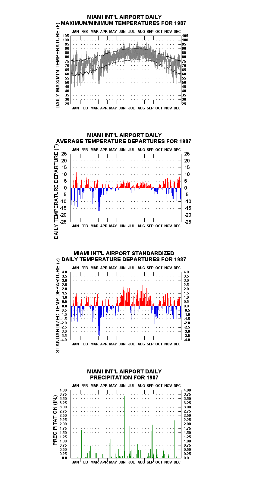
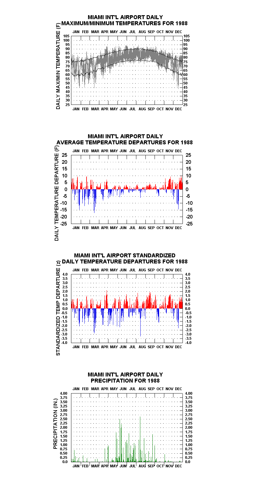
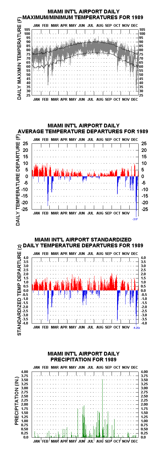
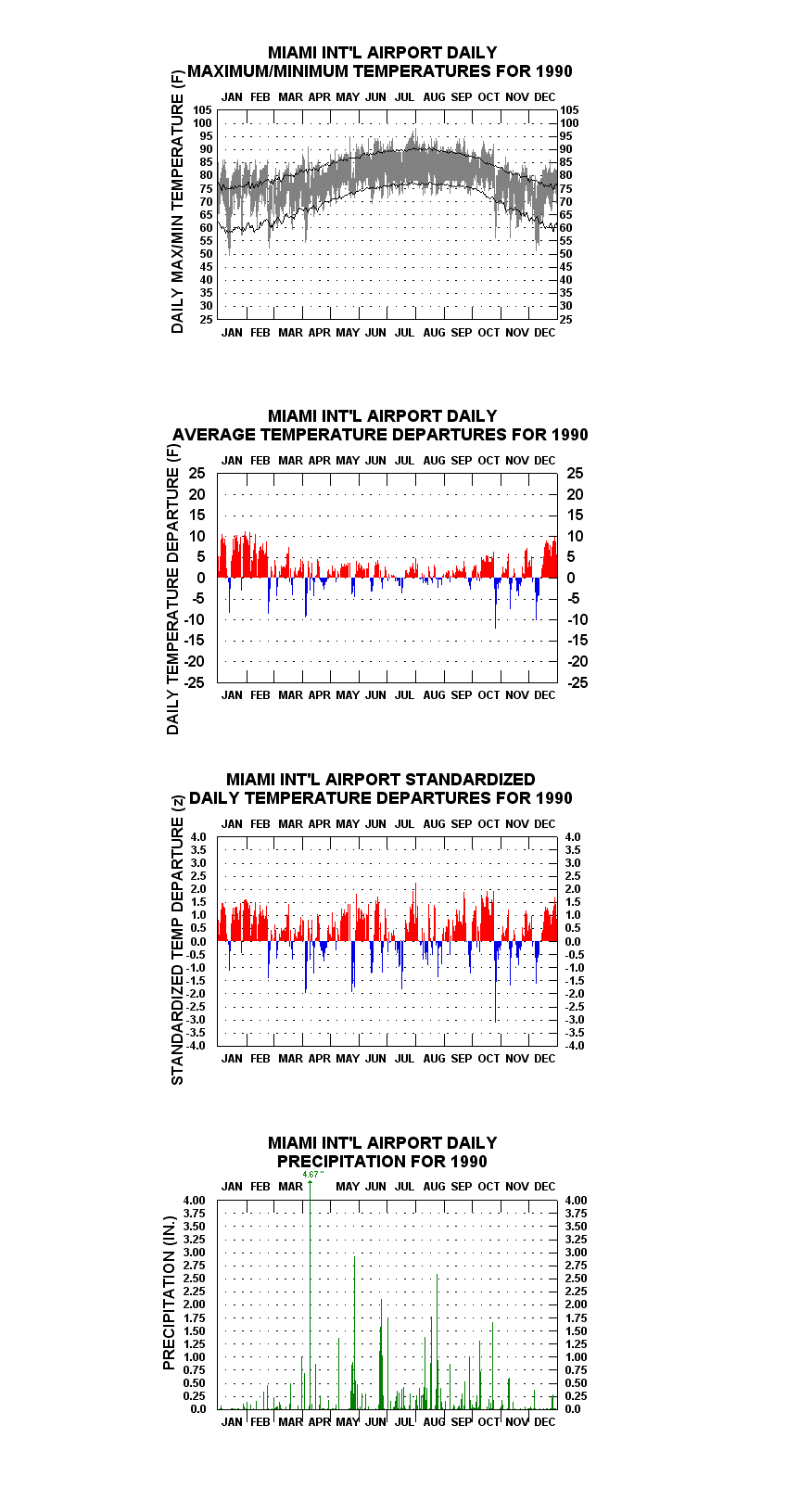
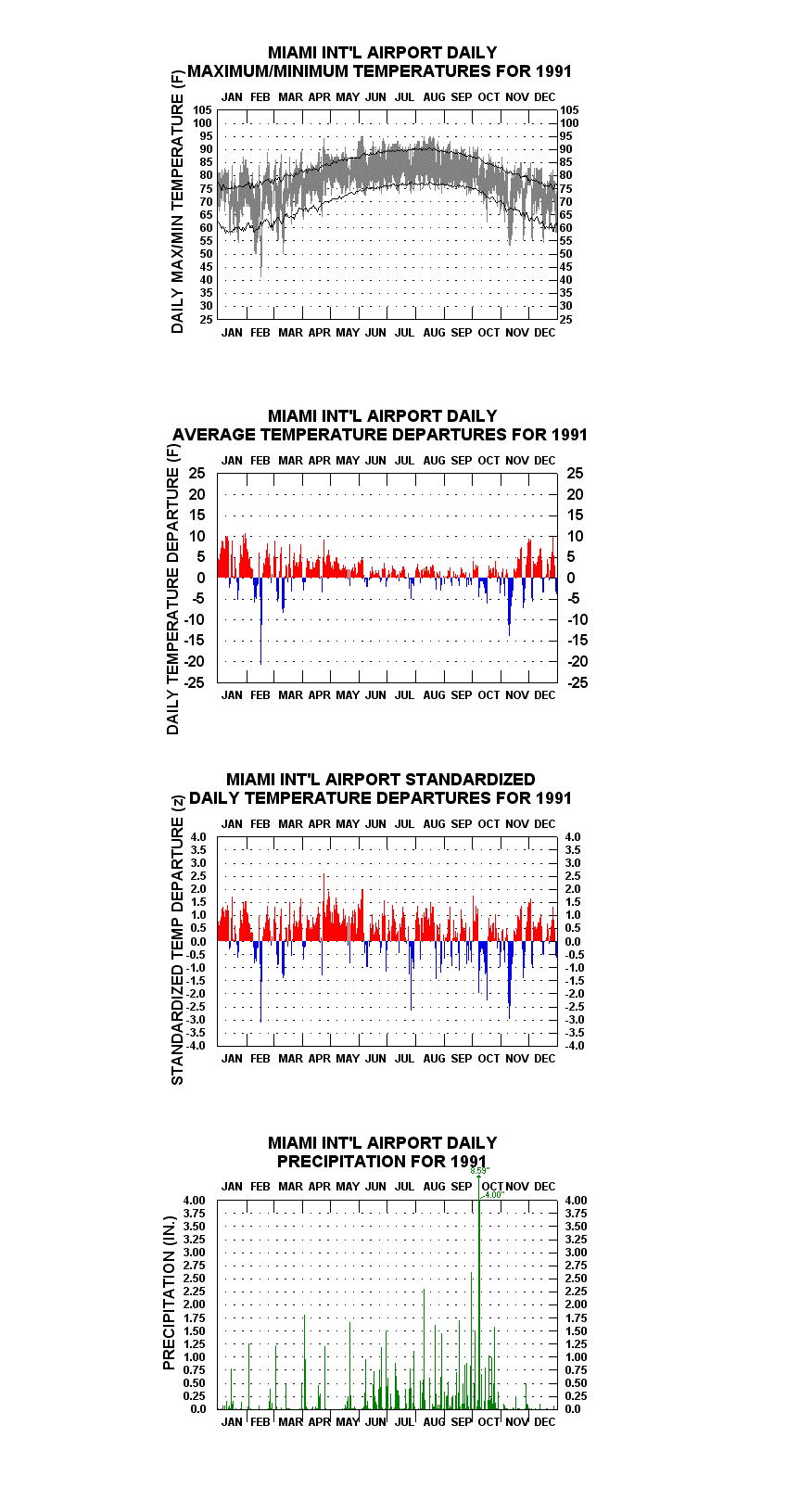
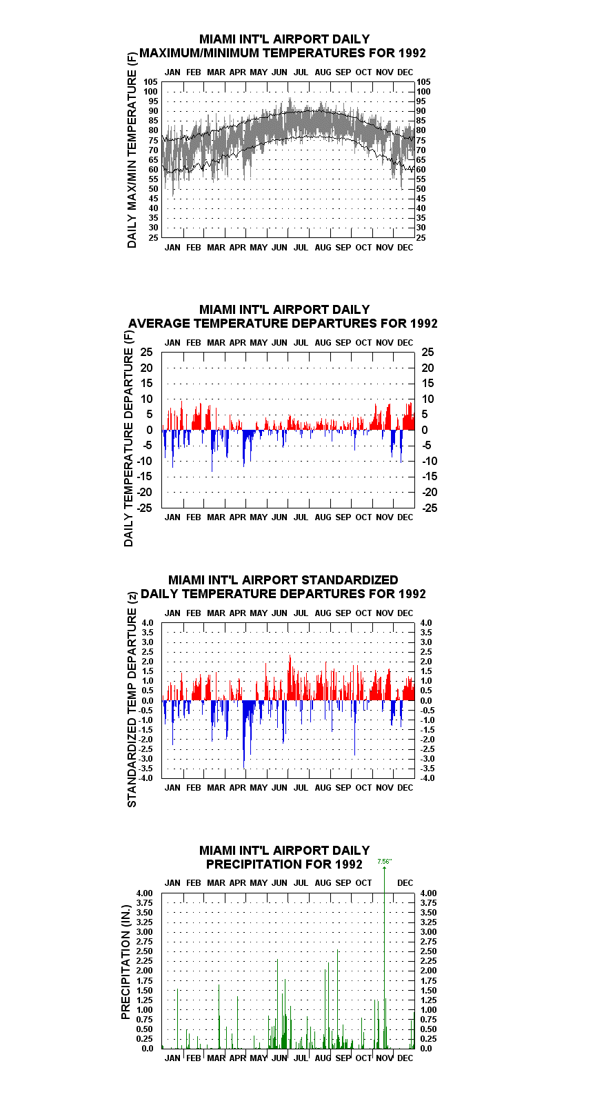
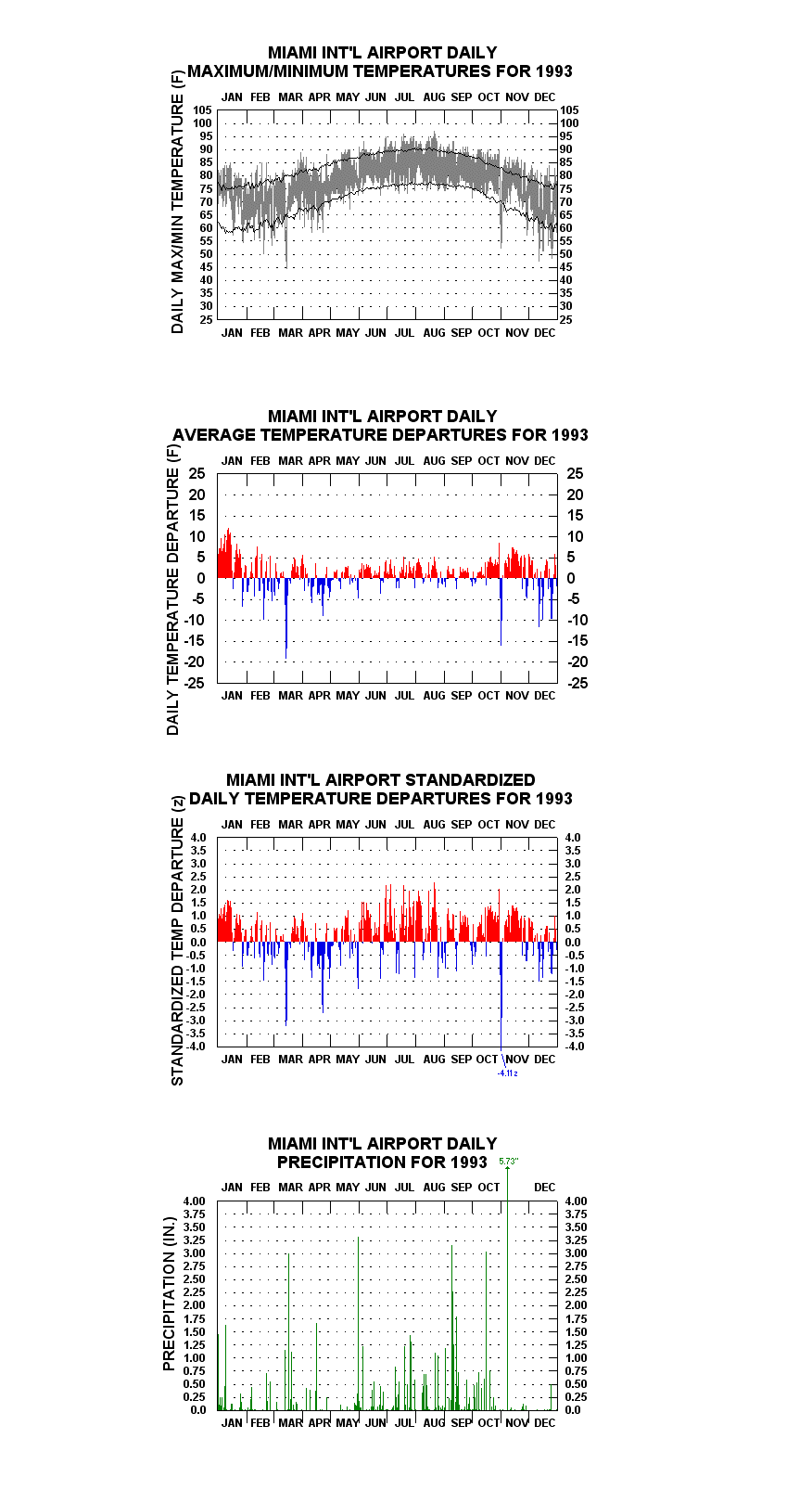
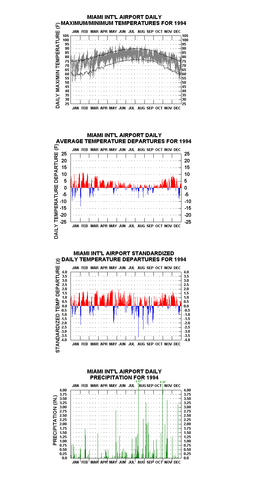
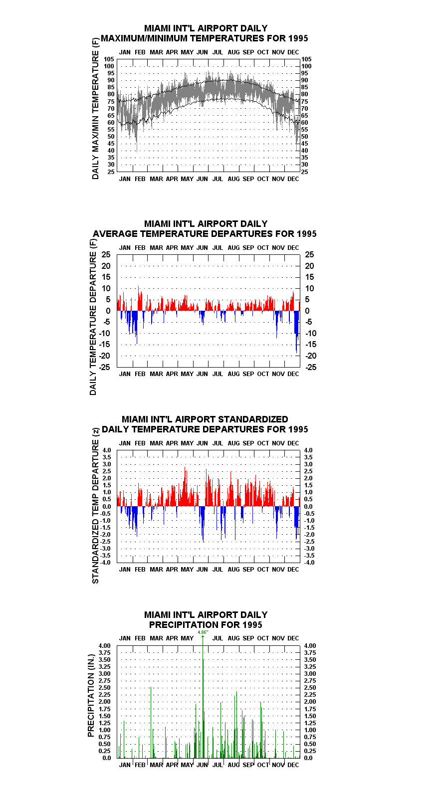
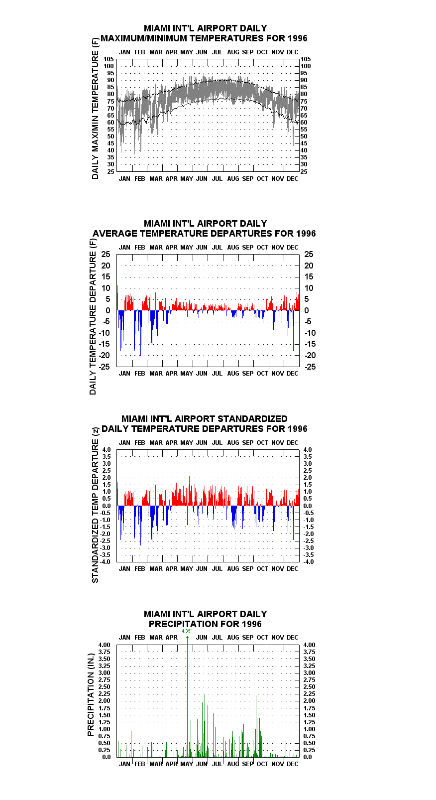
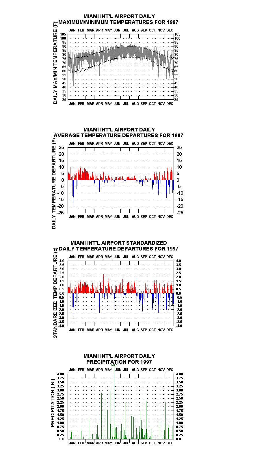
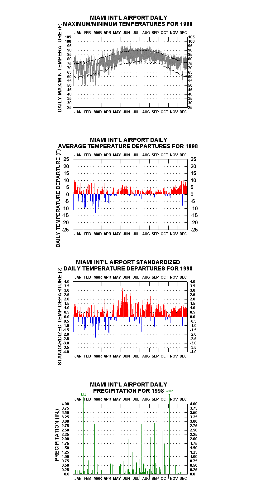
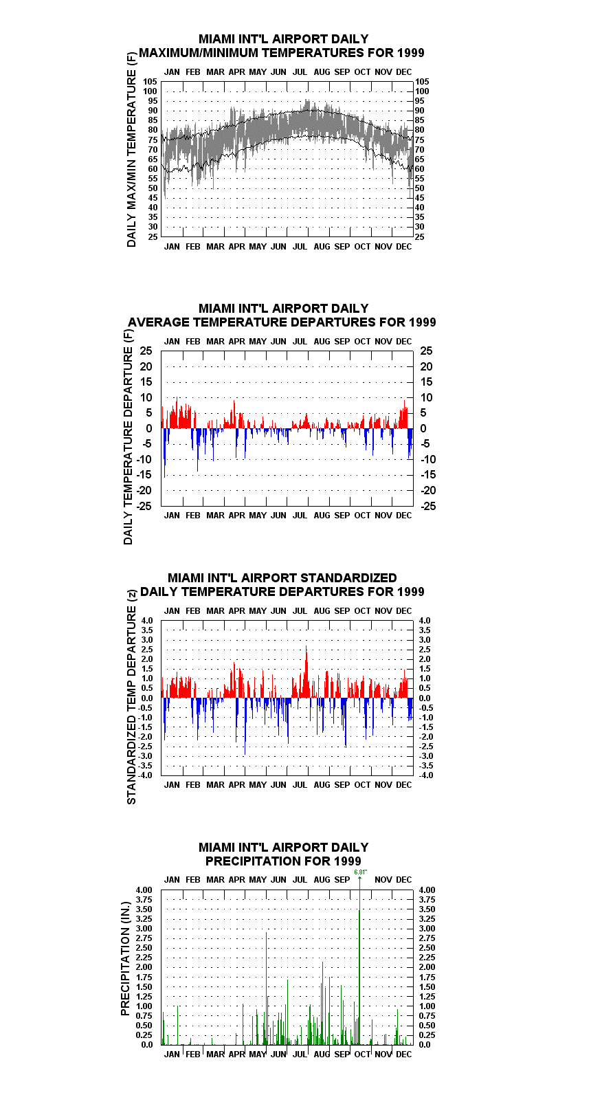
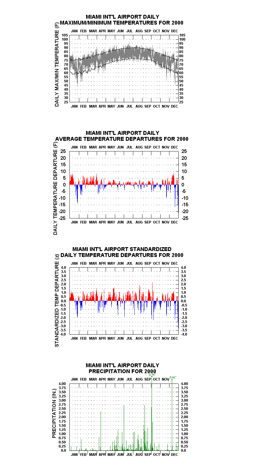
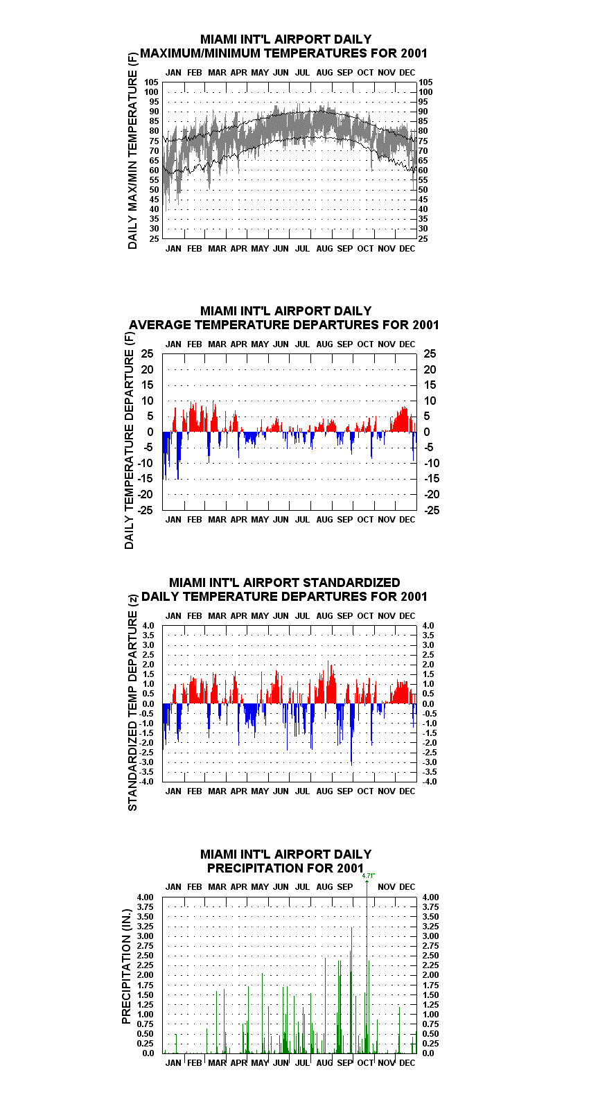
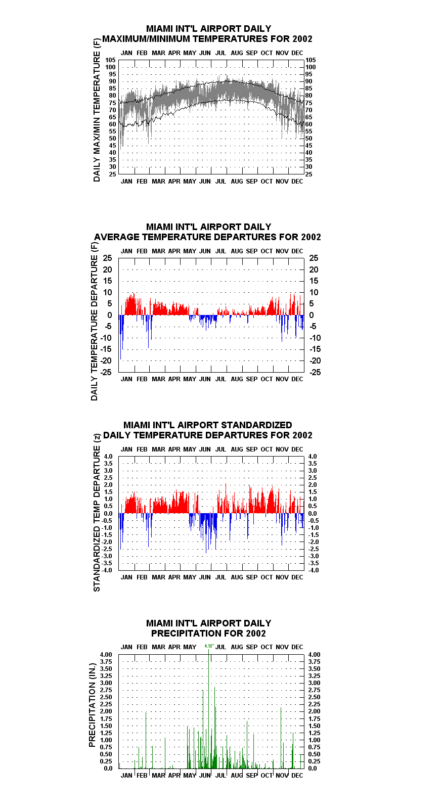
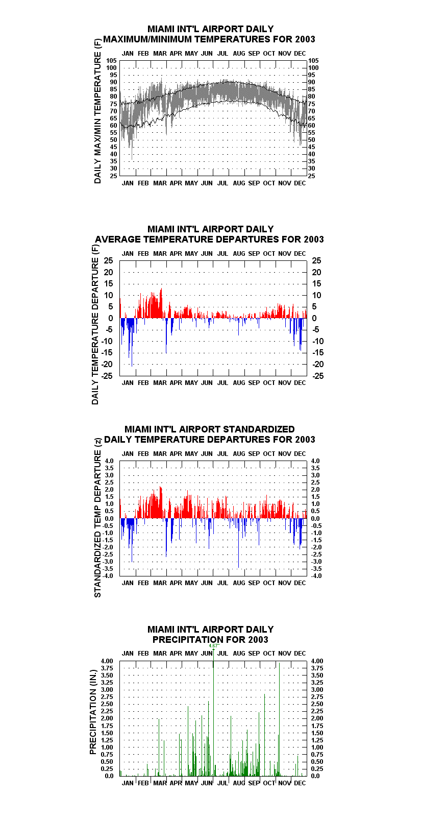
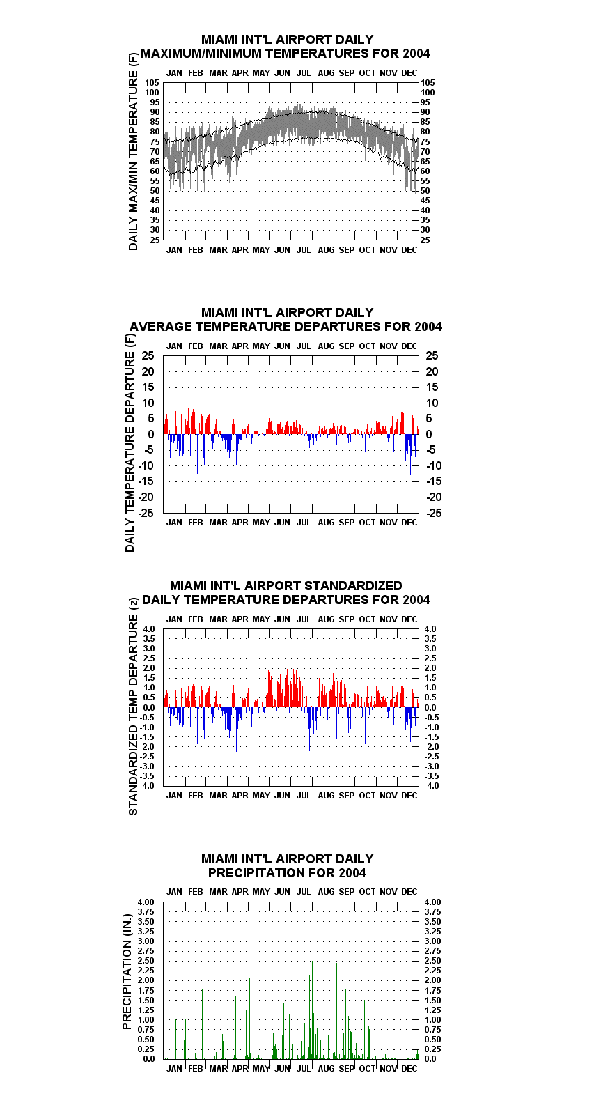
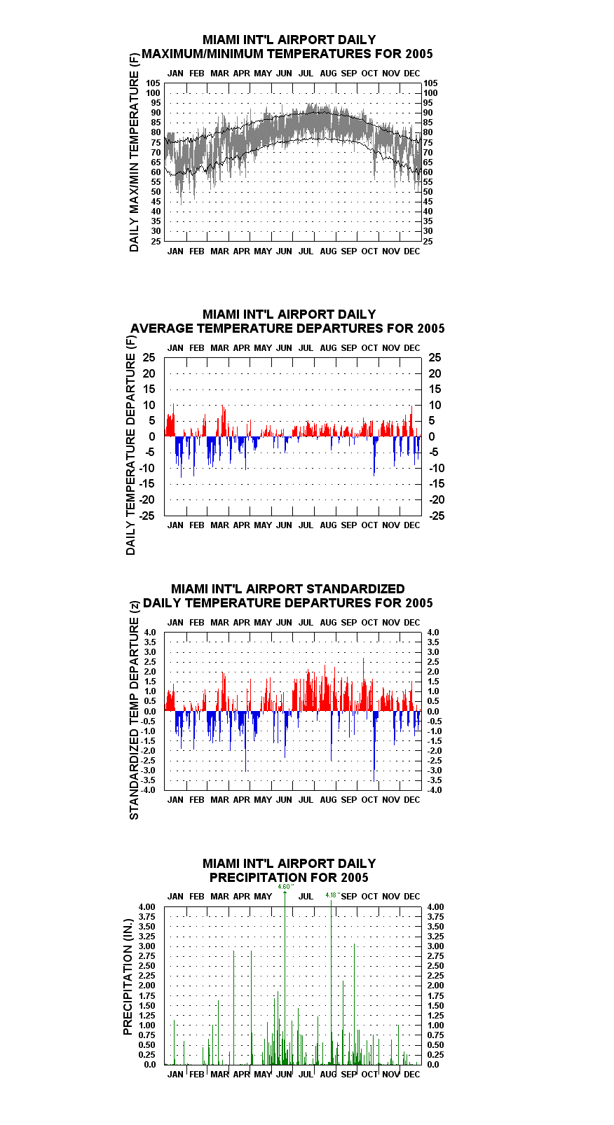
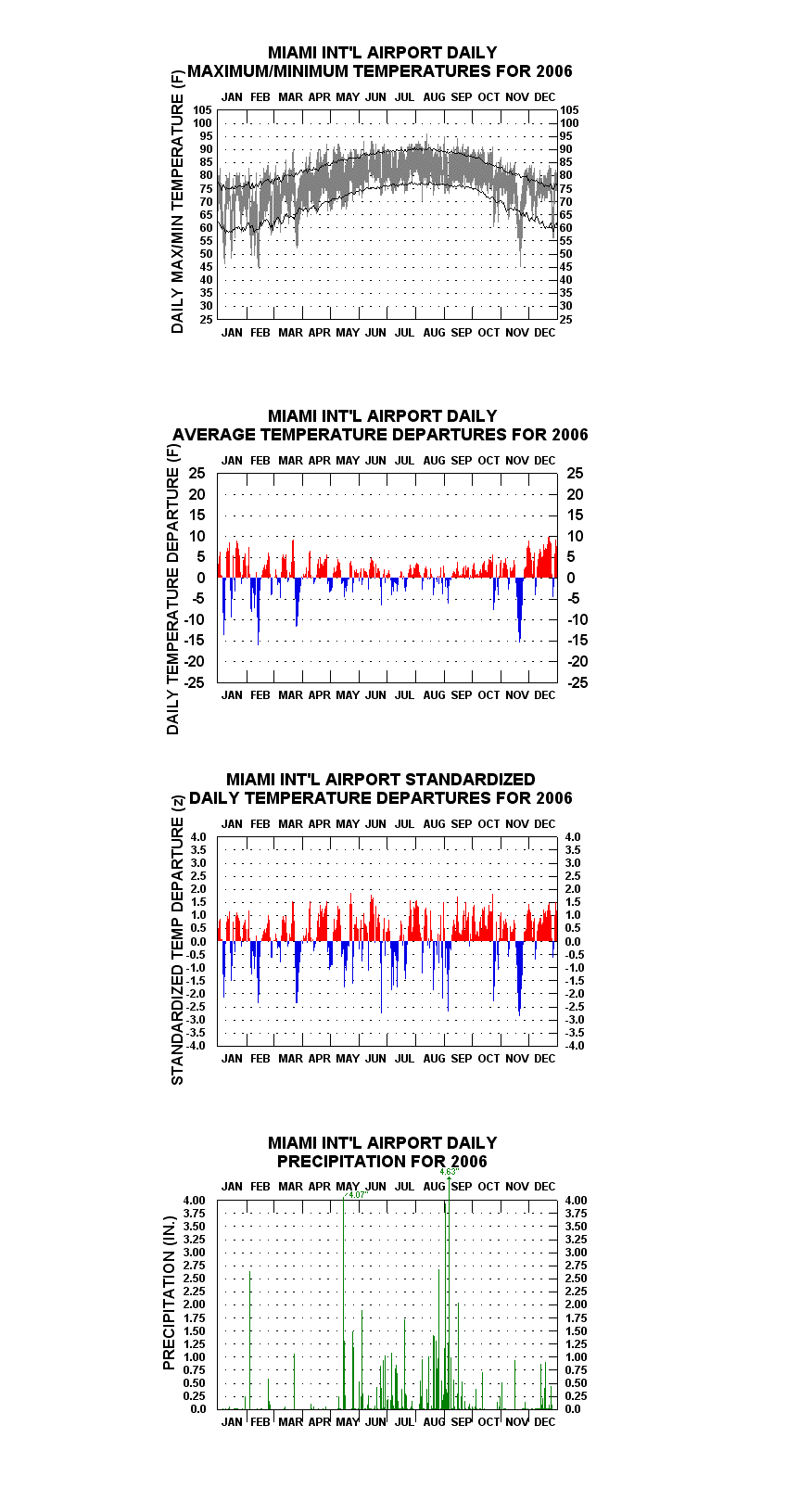
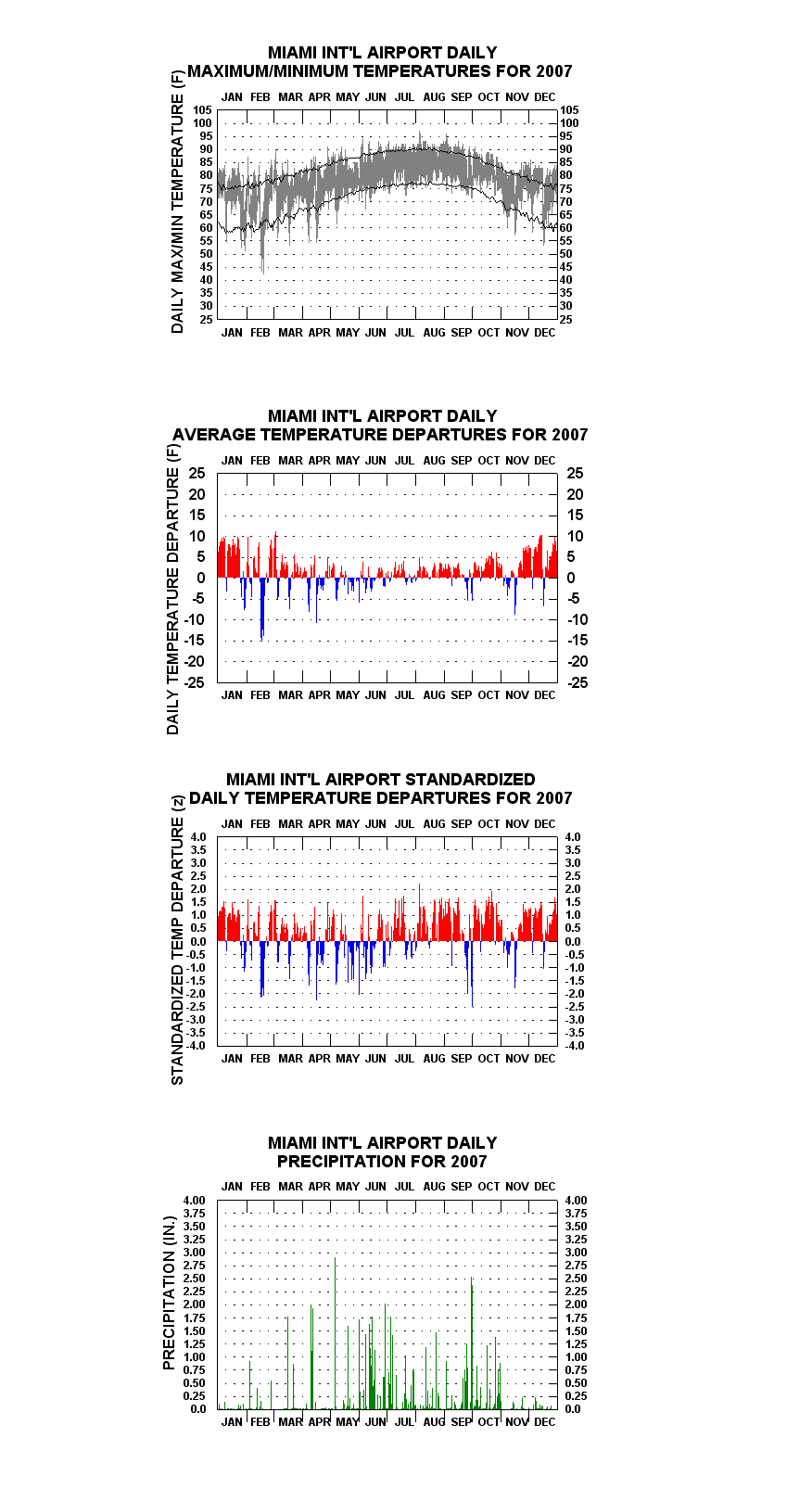
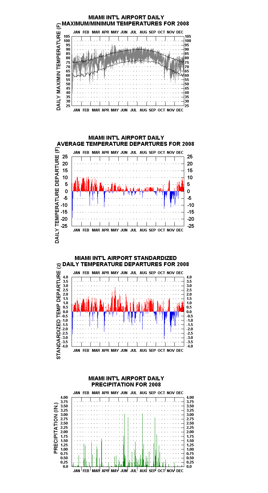
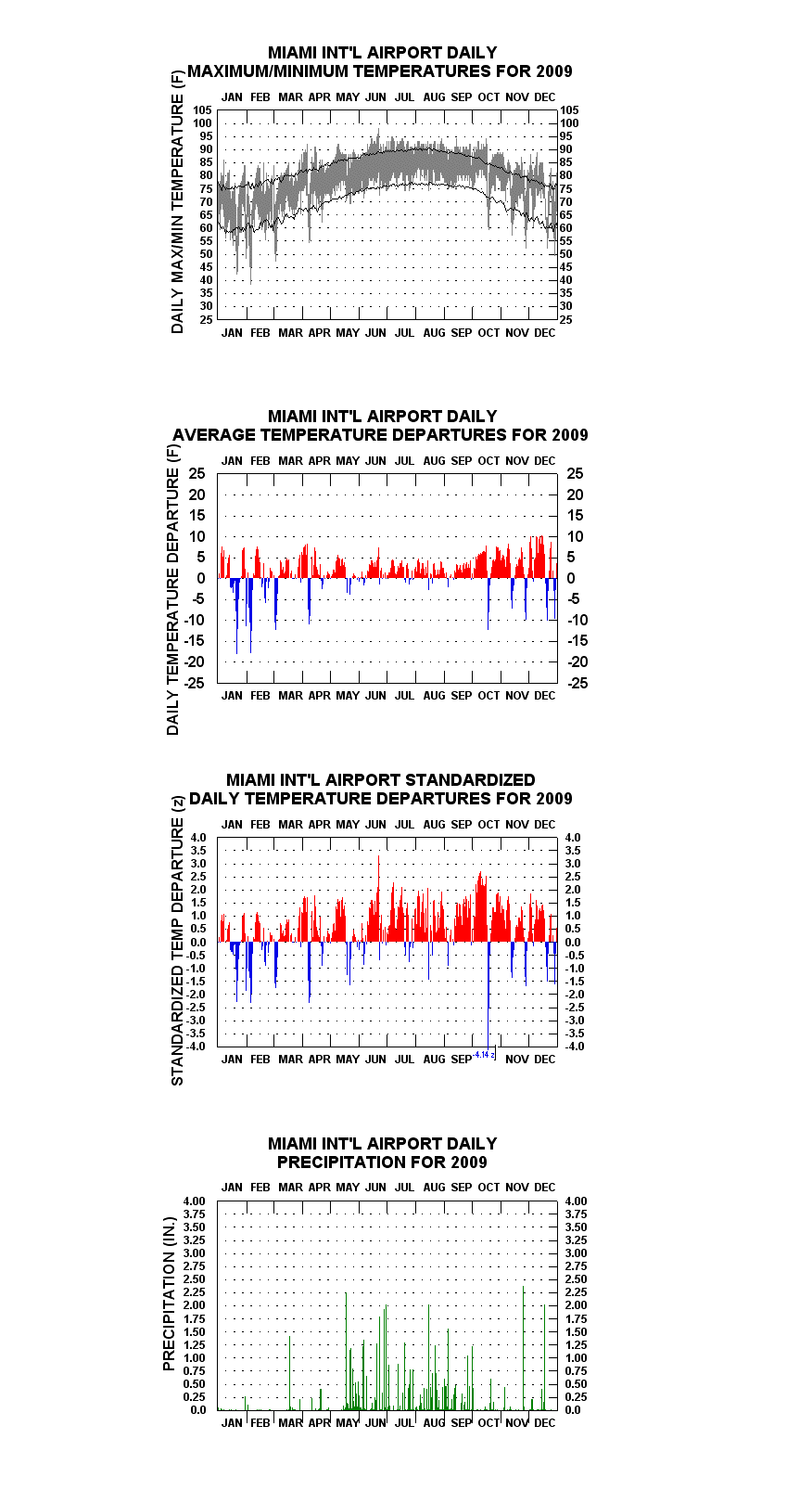
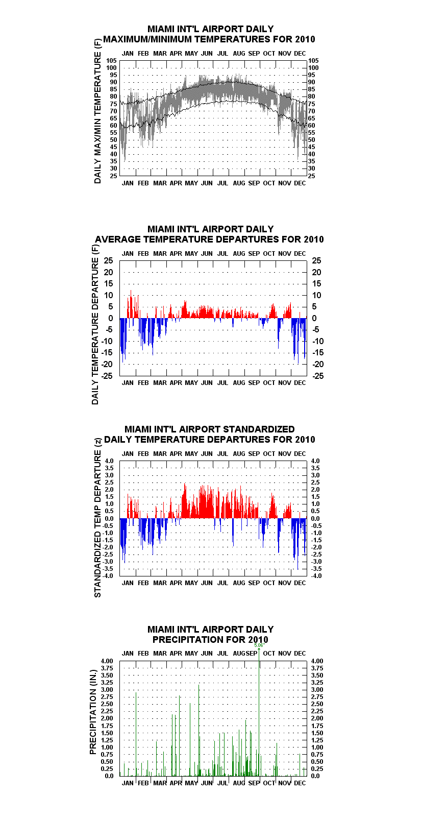
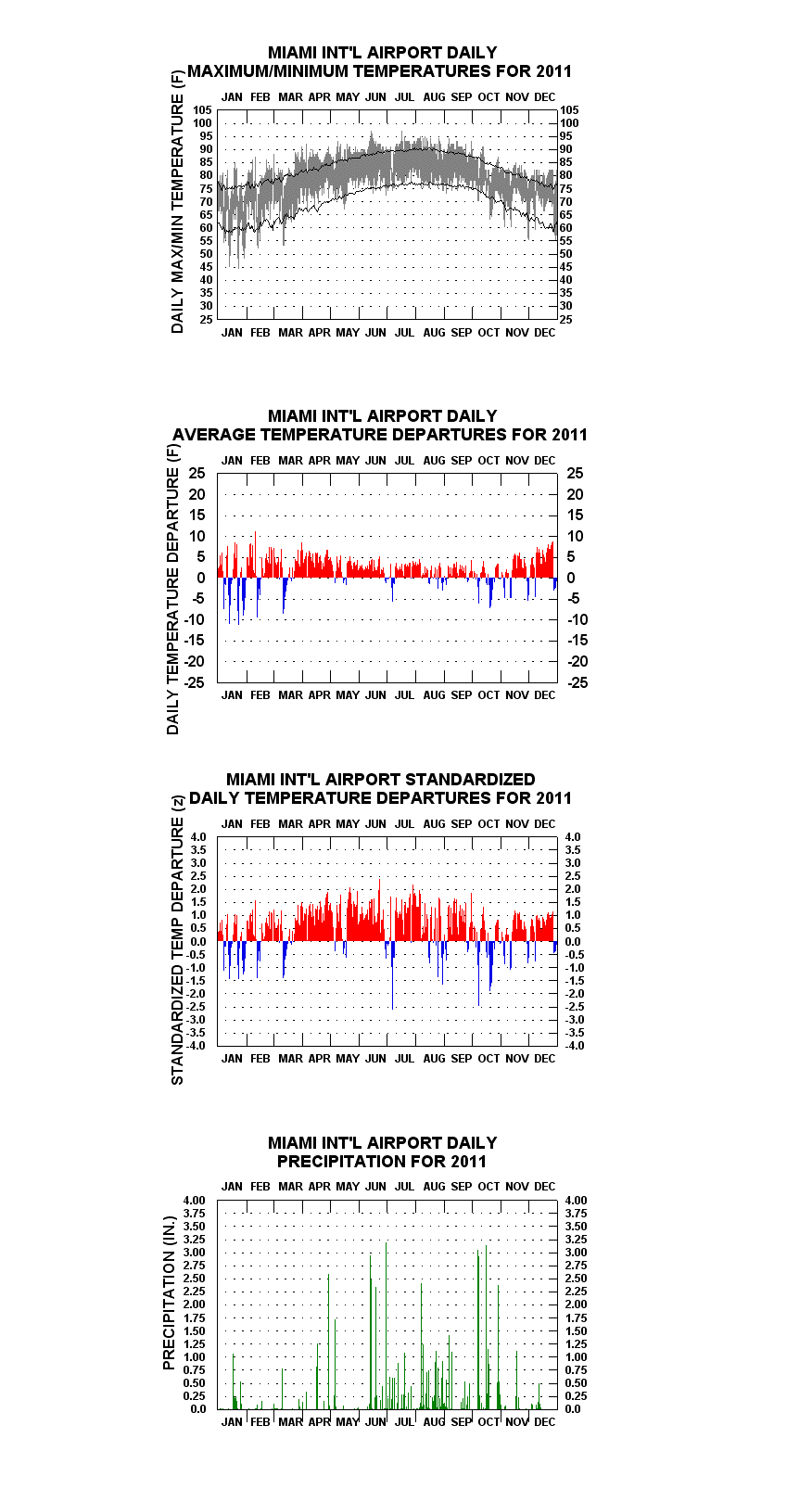
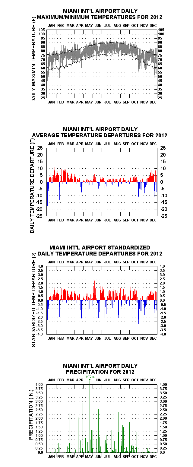
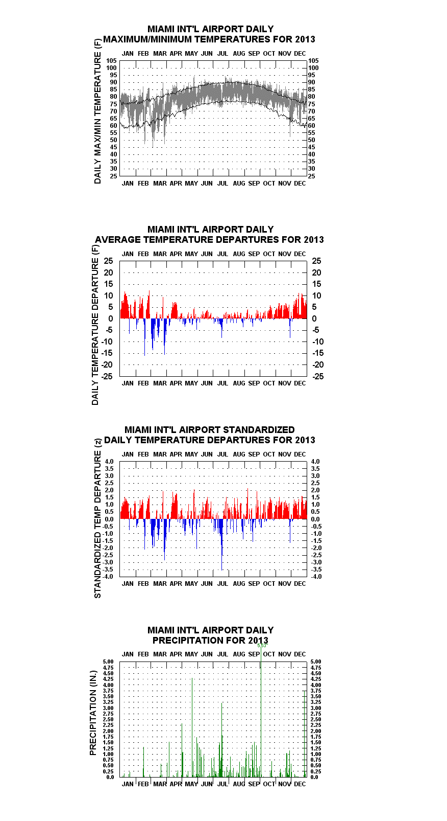
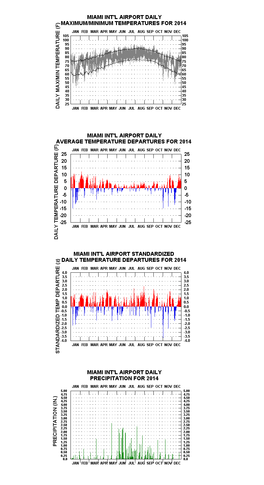
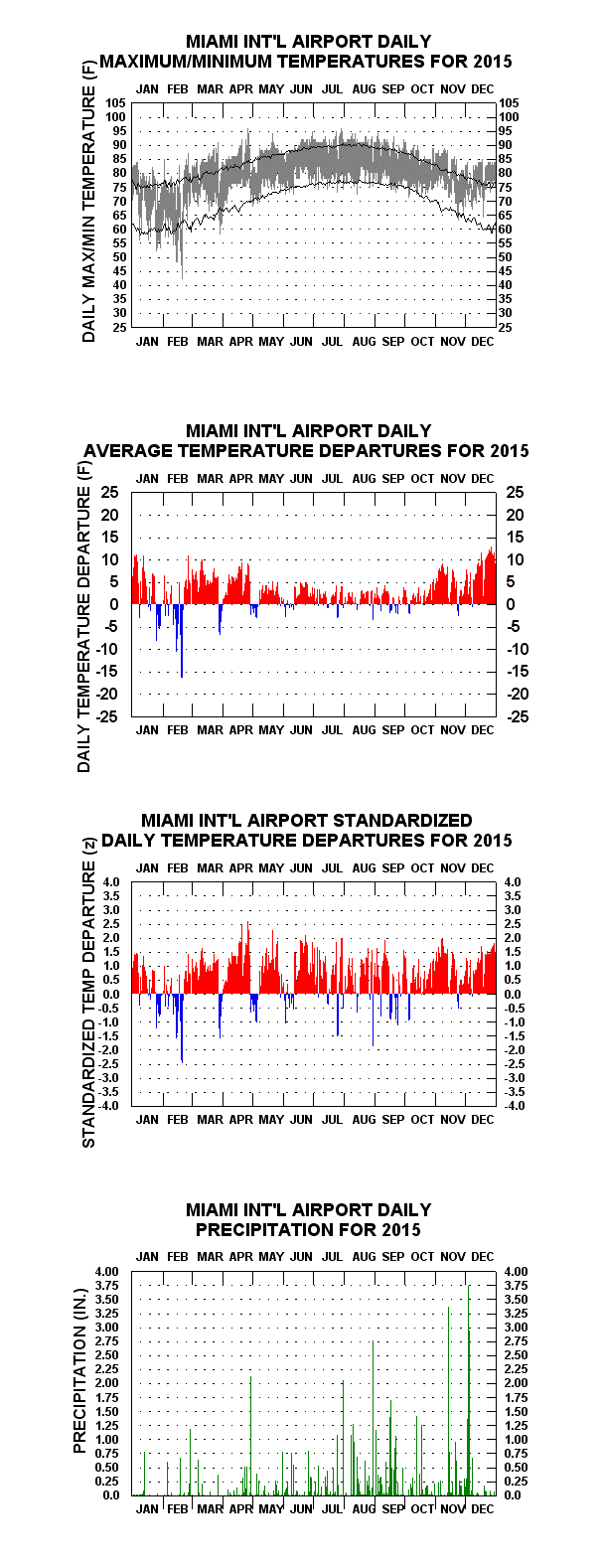
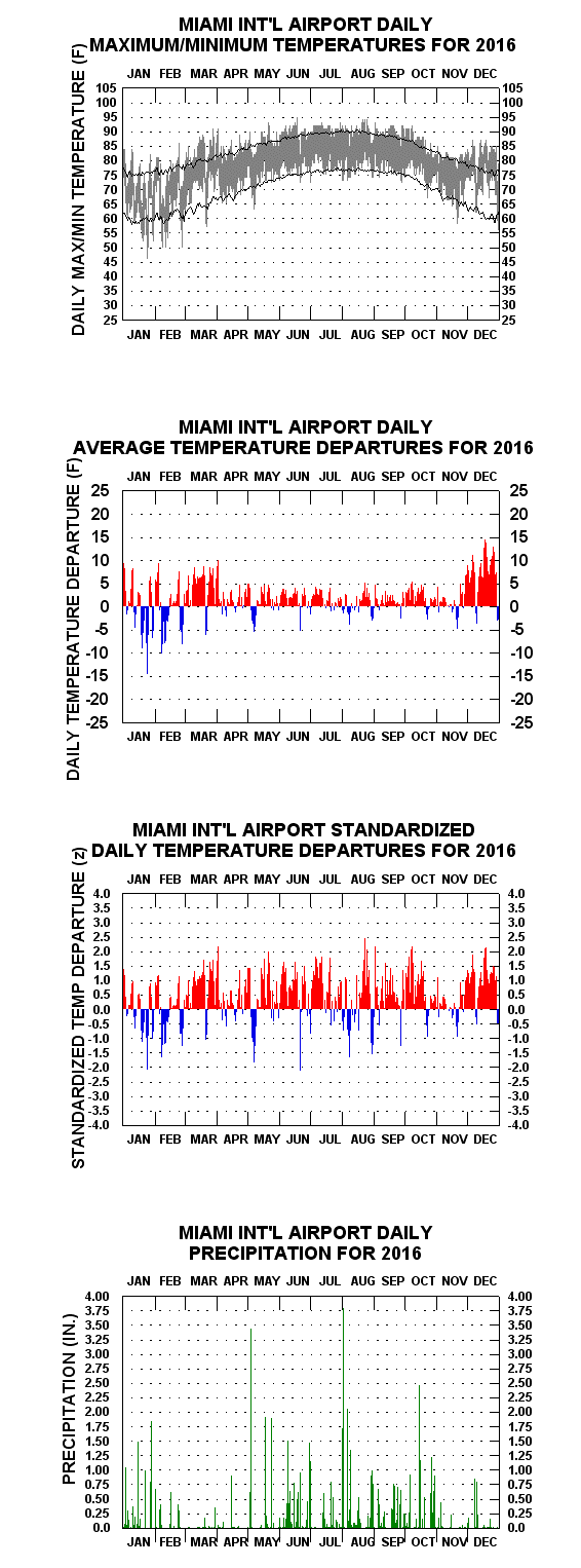
The year-to-year daily graphs pages (links below) consist of four charts tiled horizontally. The uppermost graph displays “floating-bars” or “hi-lo” depictions of the daily maxima and minima. Each bar represents an individual day’s temperature range. Superimposed are two line traces, the upper one connecting average daily maxima, the lower one average daily minima. The bars depict the varying diurnal, synoptic, long-wave, seasonal, and sea-surface temperature influences on temperature over time, and subjectively, some years’ features can be quite interesting to look at (see “REPEAT LINKS TO SOME OF THE MORE INTERESTING YEAR-TO-YEAR GRAPHS, WITH ACCOMPANYING NOTES” section below).
The second chart down shows the arithmetic departures of day-to-day mean temperatures less the corresponding calendar-day average means. Vertical lines extending upward from the zero line indicate above average means for the day (colored red), those extending downward indicate below average daily means (colored blue). In the entire series, the most extreme departure of either sign is -31 F on 24 December 1989 (associated with a daily maximum: 45 F, daily minimum: 31 F)
(Note: Clicking on the floating-bar charts a second time after they appear on the screen will enlarge them even further).
The third chart down shows the second chart’s departures in deseasonalized or “standardized” form. Standardized anomalies are calculated by dividing the arithmetic anomaly by the climatological mean temperature standard deviation for the calendar day in question, creating “z-scores”. Through the present, the most extreme z-score was -4.27 z, for 29 June 1966
Year-To-Year Graphs — OLDER YEARS
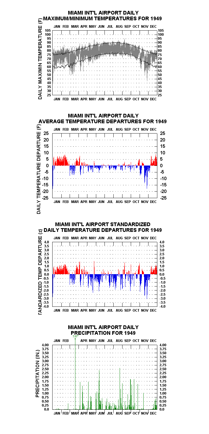
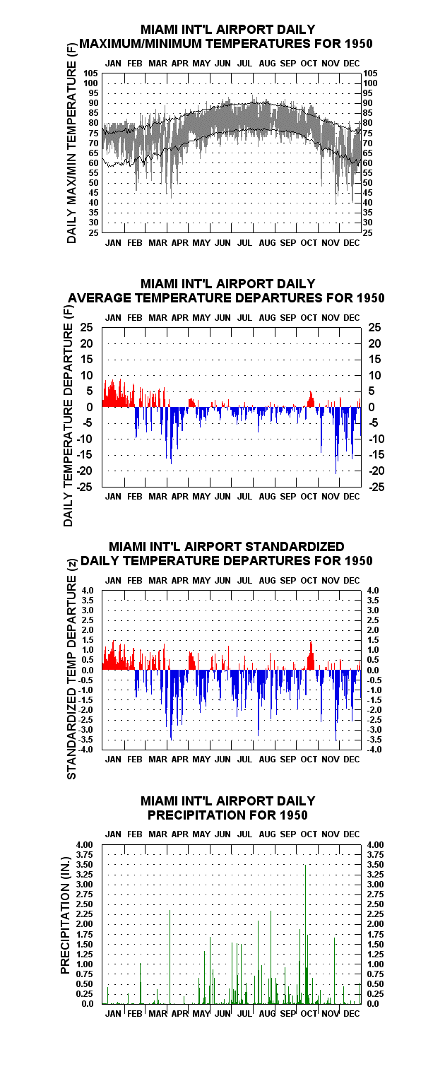
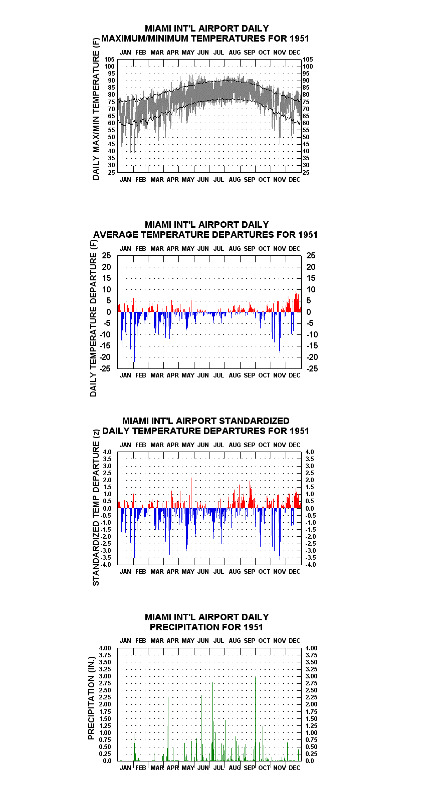
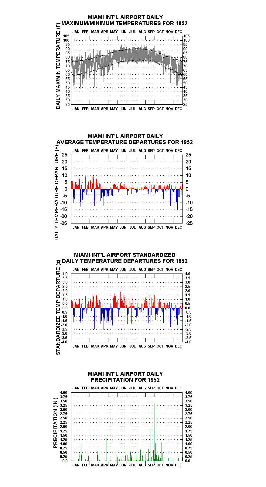
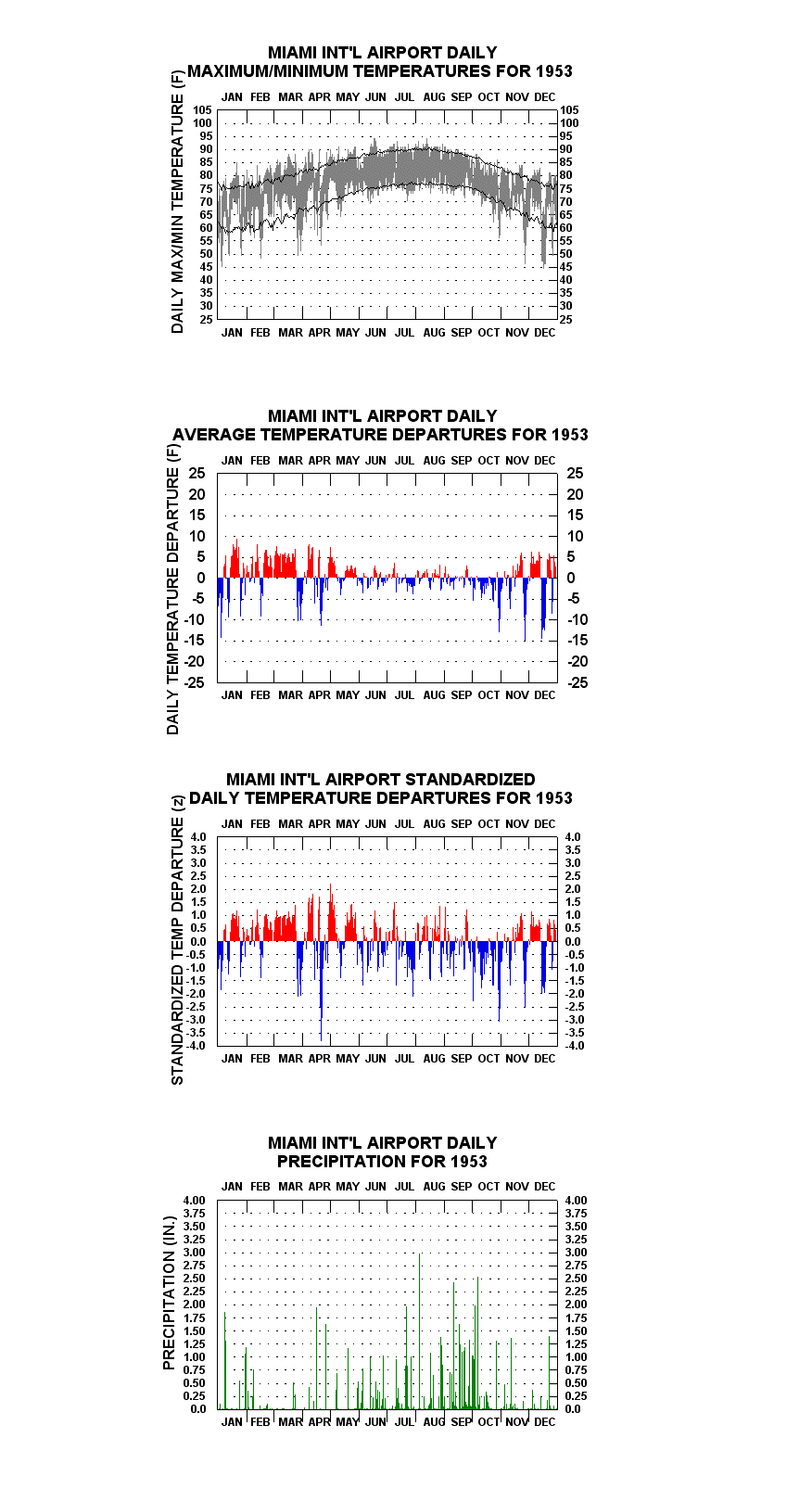
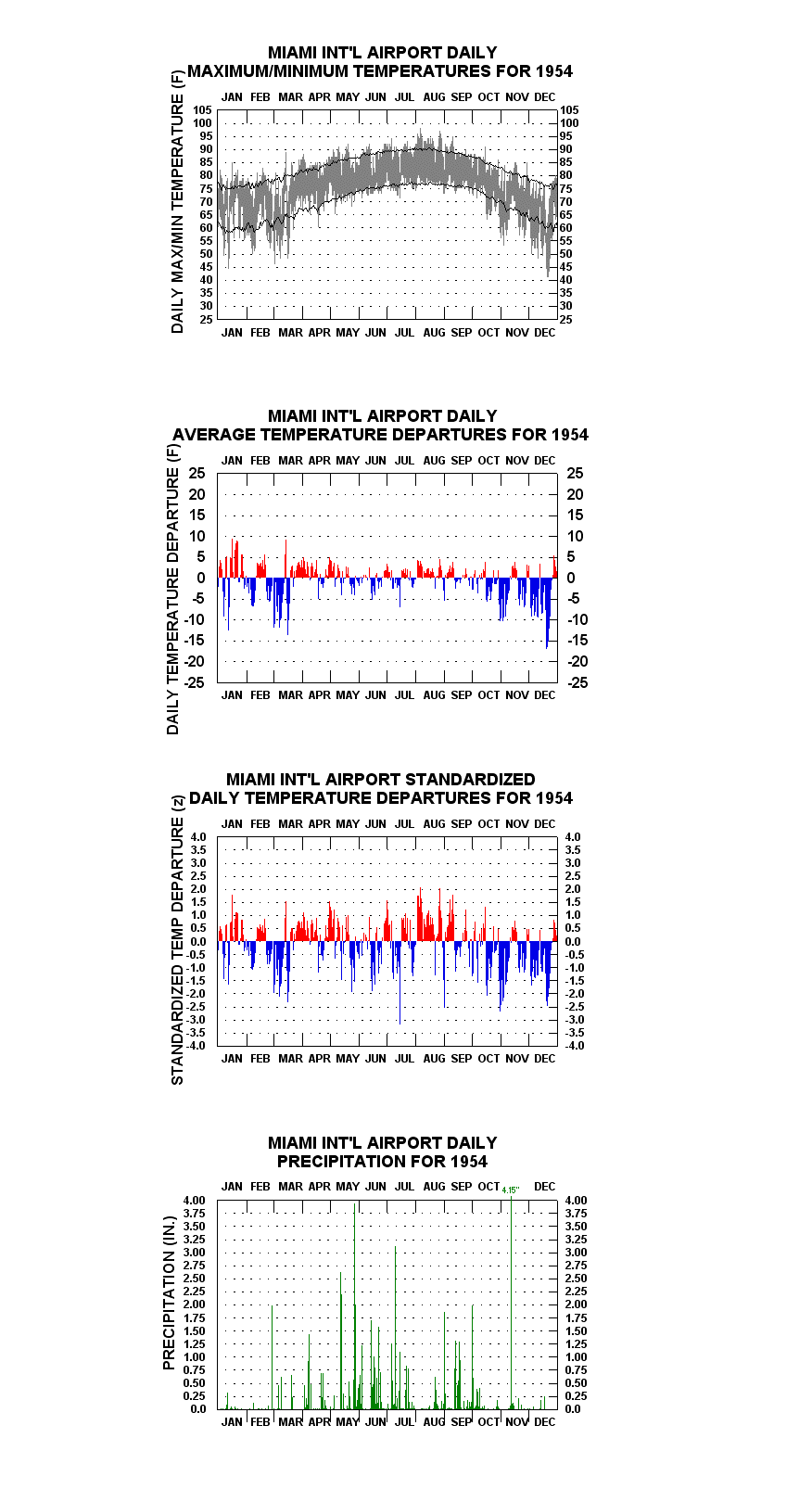
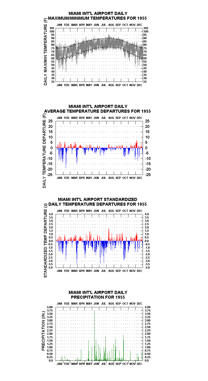
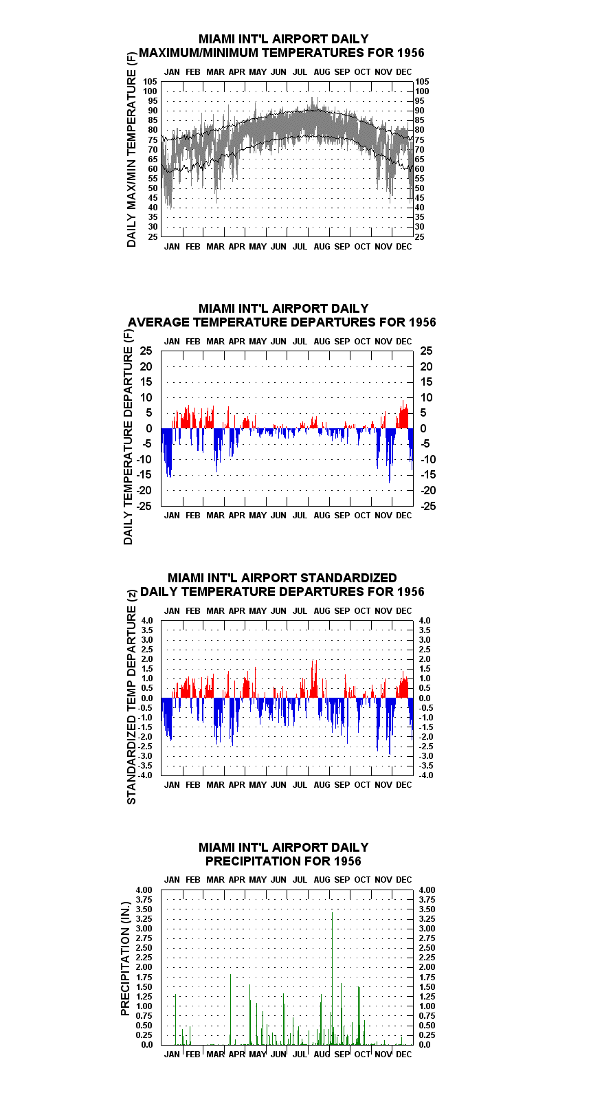
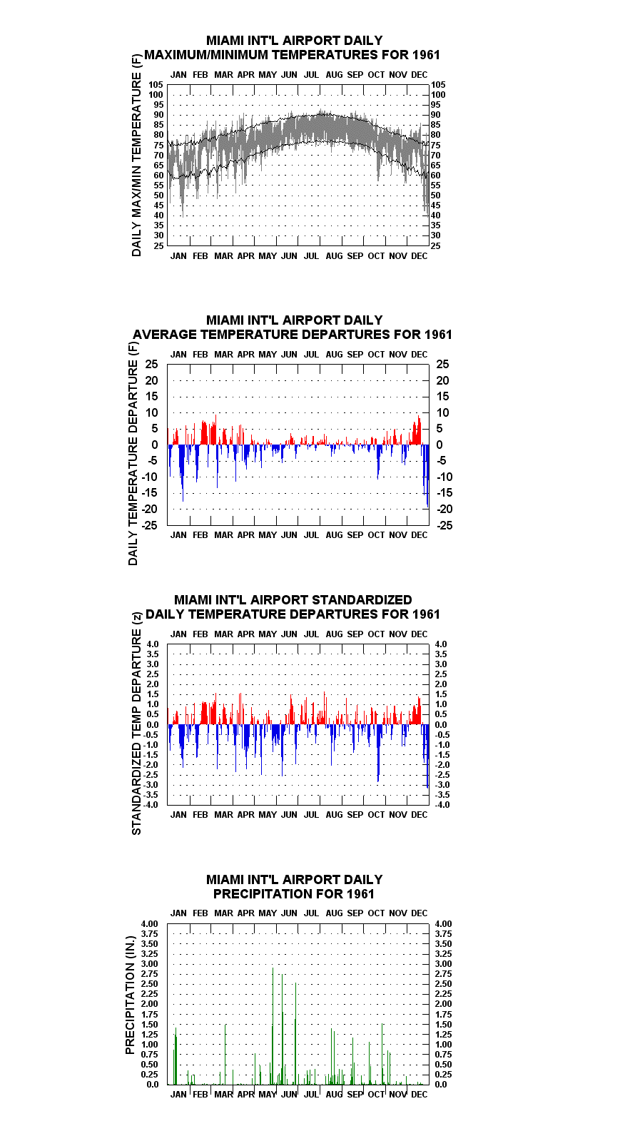
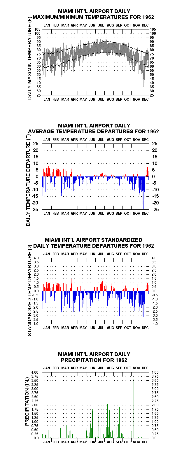
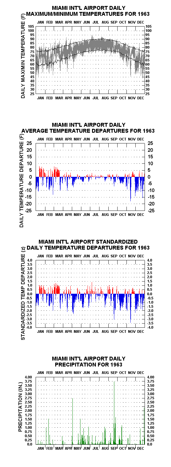
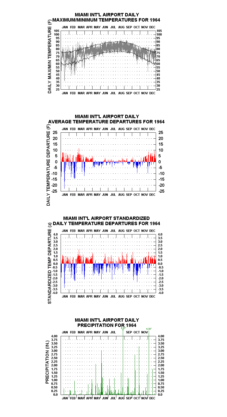
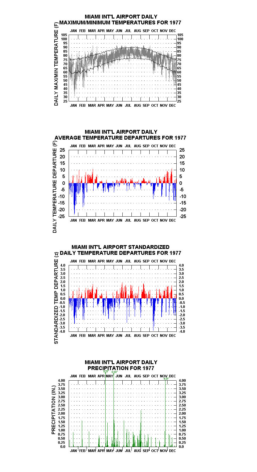
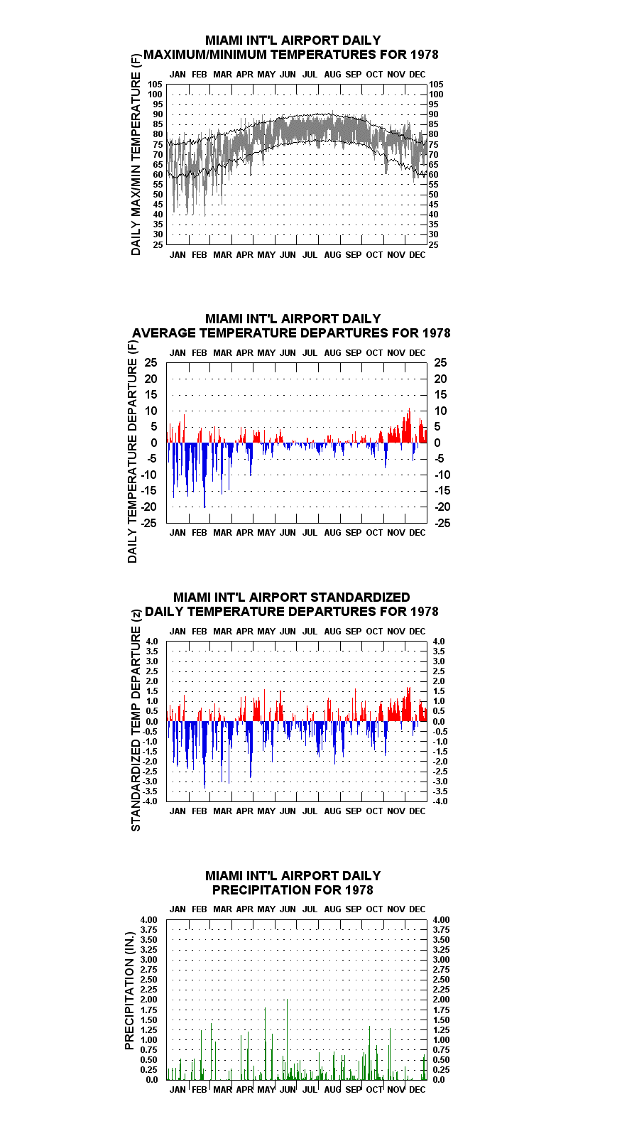
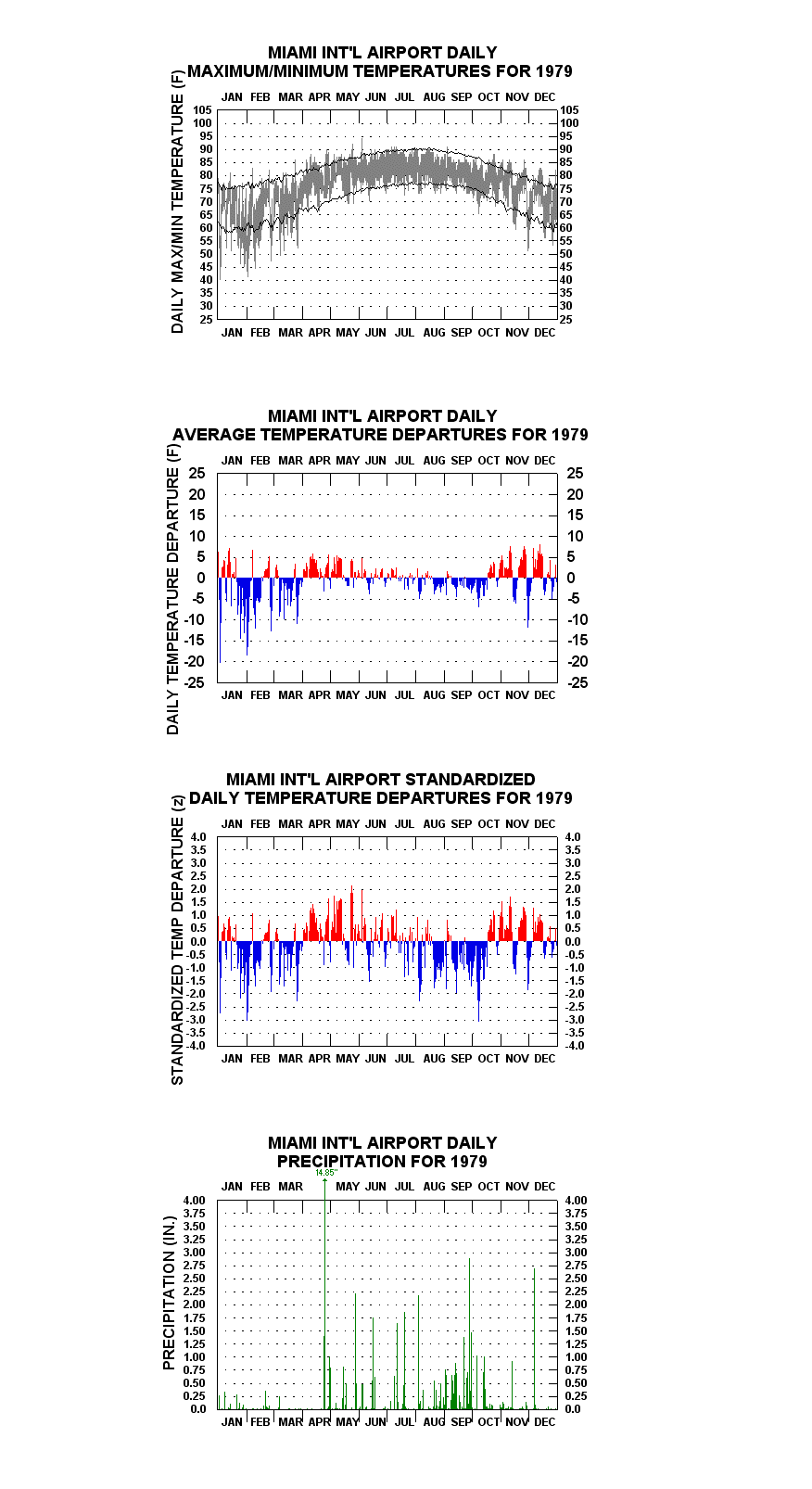
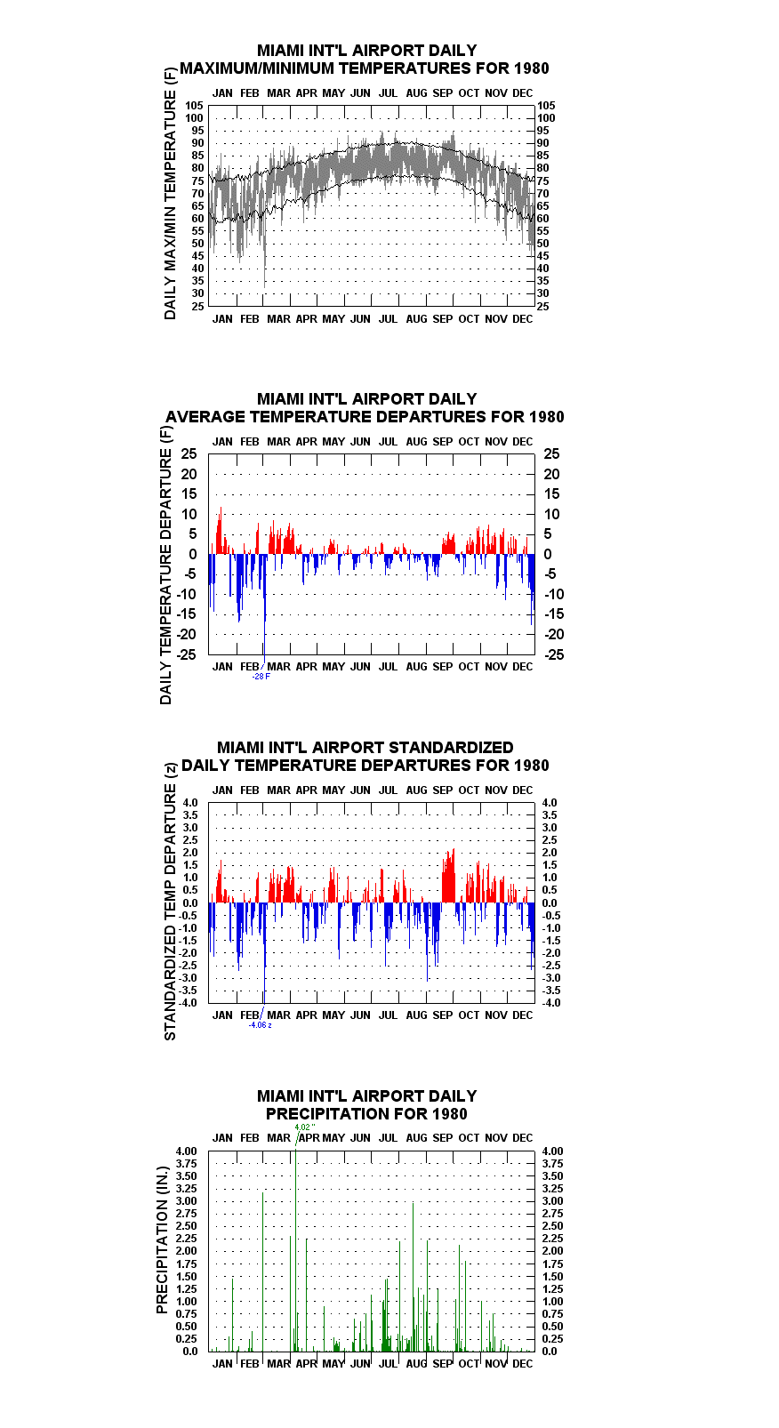
Links To Some Of The More Interesting Year-To-Year Graphs, With Accompanying Notes
Mild January.
Driest year (37.00′) since 1927, and driest since that year. Only 0.02″ in March.
7.02″ rain on 1 May.
February coolest calendar month in Miami history down to present (59.4 F); 18.14″ rain in June.
20.56″ rain in June, 89.33″ for the year (highest amount for any year through the present and back through 1902).
24.40″ rain in September, most for any individual calendar month since October 1924 (25.02″). Included 6.07″ in connection with Hurricane Donna
6.41 dropped on 27 August from Hurricane Cleo
Relatively cool July/August. Heavy single-day rainfall totals in September/October. More than 6″ dropped over 7-8 September from Hurricane Betsy.
Relatively cool Summer by Miami standards; 82.06″ rainfall for the year..
Nearly 41″ rainfall over May and June, 83.39″ for the year
Just 1.78″ rainfall over January-April; 0.07″ in April. 96 F on 30 April highest ever recorded in April.
Another relatively cool Summer.
Warmest year in the historical record up to this time (77.3 F), surpassing 1911 (76.2 F).
Second warmest year to date, 0.3 F cooler than last year’s record-setter.
Relatively cool in June and from August-October.
Great Arctic outbreak of January drops mercury to 31 F on the 20th. Infrequent rain-days over January-April, but 28.24″ rain over May and June.
14.85″ rain 25 April, record highest for single calendar day.
Late season cold snap drops temperature to 32 F on 2 March. Afternoon maximum just 53 F; daily mean 28 F below average for day (4.1 standard deviations below). 95 F on 1 October sets all-time record high for that month.
32 F on 13 January. More than 27″ rain over August and September.
Annual mean temperature (77.5 F) surpasses 1974’s previous high mark by 0.2 F).
Very wet and cool over late May.
30 F on 22 January.
Persistent above normal warmth from late October almost through year-end. Warmest November in history.
88 F on 19 January ties maximum record for this calendar month. August warmest calendar month in history (85.4 F) up to this time.
Strange weather year. Less than 0.1 F cooler than warmest on record 1982, but with several sharp, abbreviated, cold snaps. Record cold minimum for October set (53 F). Daily max/min on 24 December just 45 F/31 F, 31 F below normal for day and 4.26 standard deviations below. Only 5.40″ inches’ rainfall through May – about 1/3 of normal. Year finishes with 42.63″, driest since 1956.
Warmest year in history (78.2 F) by 0.7 F.
21.64″ rainfall in October. Wettest year (71.42″) since 1969
Sharp, abbreviated cold snap in late October.
Second warmest year (78.1 F) in history. Wettest (79.56″) since 1968.
20.33″ rainfall in June, another wet year overall (79.31″).
Much above normal warmth over much of May to August. Third warmest year in history (77.9 F) overall.
More than 10″ rain dropped over 14-15 October from Hurricane Irene.
12.56″ rainfall on 2 October.
Warm and relatively dry except for a wet/relatively cool pattern from mid-May to early July. 91 F on 6 November sets record high maximum for that month.
Unusually warm over February and March. 93 F on 22 March, highest ever in March.
4.18″ rain dropped on 25 August from Hurricane Katrina.
Nearly 30″ rain over August and September.
Third warmest year (77.9 F) in history. Driest (52.09″) since 1989. 88 F on 2 December sets record high maximum for that month, only to be broken on the 10th with 89 F reached.
Coolest year (75.8 F) since 1985, but warmest calendar month (June: 85.5 F) in history. 48 F on 10 January, lowest daily maximum ever recorded for a January
Warmest year (78.3 F) in Miami history to date.
Wettest Year in Miami since 1959.
Warmest Year to date (79.2 F) in Miami history.
* Member, American Meteorological Society
Data Collection 08Analytics
Sample Regimes, PCA Modes, PDFs & Extremes+
Rainfall+
Regimes+
Sample analysis: group years by recurring wet- and dry-season rainfall patterns for Miami, then compare transitions between common, unusual and persistent regimes. This is sample Analytics content for layout and workflow testing. Replace it with the station’s verified analysis when the final material is ready.
Extremes+
Sample analysis: review the upper and lower tails of the rainfall record for Miami and identify years that merit detailed chart interpretation. This is sample Analytics content for layout and workflow testing. Replace it with the station’s verified analysis when the final material is ready.
Temperature+
PDFs+
Sample analysis: compare the central distribution and tail behavior of temperature observations at Miami. This is sample Analytics content for layout and workflow testing. Replace it with the station’s verified analysis when the final material is ready.
Extremes+
Sample analysis: review the upper and lower tails of the heat record for Miami and identify years that merit detailed chart interpretation. This is sample Analytics content for layout and workflow testing. Replace it with the station’s verified analysis when the final material is ready.
Wind+
PCA Modes+
Sample analysis: demonstrate how leading modes can separate broad wind variability variability from shorter-lived anomalies at Miami. This is sample Analytics content for layout and workflow testing. Replace it with the station’s verified analysis when the final material is ready.
Extremes+
Sample analysis: review the upper and lower tails of the high-wind events record for Miami and identify years that merit detailed chart interpretation. This is sample Analytics content for layout and workflow testing. Replace it with the station’s verified analysis when the final material is ready.
Continue Exploring
Compare Climate History Across Every Station
Browse domestic and international climate archives, long-term trends and original statistical visualizations.